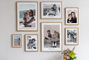
A messy gallery wall can ruin a room. Frames clash. Photos fight for attention. And suddenly your “cute idea” looks like a cluttered notice board.
But when you plan it right, a picture gallery wall can feel calm, neat, and stylish. It can guide the eye instead of confusing it. It can even make a small space feel more polished and put together.
I’ve tried a few of these setups at home, and trust me, the difference between random and organized is huge.
16 Timeless Picture Gallery Wall Layouts
Ever walked into a room and felt relaxed without knowing why? A clean gallery wall often plays a big part in that. Let’s look at some ideas that keep things tidy and still full of personality.
1. Soft, Organic Layout with Matching Frames

This setup uses assorted black frames on an olive wall, filled with black-and-white family photos. The arrangement feels natural and slightly staggered, and a houseplant softens the whole look.
This works because the frame color stays consistent, even though the layout feels relaxed. So the wall looks personal, not chaotic.
If you want this style:
- Stick to one frame color
- Use black-and-white photos for unity
- Let the layout feel a bit loose, but not random
I tried this in a reading corner once, and it instantly felt warmer. Not stiff. Not messy. Just right. IMO, this style works best when you want personality without visual noise.
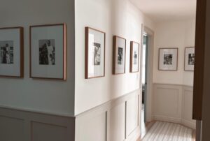
2. Vertical on Narrow Spaces

Here, four identical square black frames stack vertically on a narrow white pillar. Each frame shows urban and architectural photography.
This idea keeps things super clean because:
- All frames are the same size
- The layout follows a straight vertical line
- The subject matter stays consistent
Got a skinny wall or awkward pillar? Why leave it blank when you can turn it into a mini gallery?
This works great in:
- Hallways
- Stair landings
- Between doorways
It feels intentional, not like you just filled space for the sake of it.
3. Clean Grid Above Furniture

This wall features six large black frames arranged in a 3 × 2 grid above a black console table. Overhead gallery lighting adds a sleek finish.
The magic here is the perfect alignment. Nothing feels off or crowded.
To copy this look:
- Use equal spacing between frames
- Keep frame sizes identical
- Center the grid over the furniture
Ever noticed how grids instantly make things look more expensive? That’s not your imagination. Order always reads as luxury.
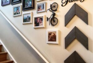
4. Mix Vintage Frames

This staircase wall shows a dense mix of gold and dark wood frames in different sizes. The tones feel warm, and the arrangement fills the space without looking messy.
So why does it still feel organized?
- The colors stay within a warm, classic palette
- Frames sit close together in a tight cluster
- The white wall balances the visual weight
If you love vintage finds, this style lets you show them off without chaos. FYI, grouping frames close together often looks more intentional than spacing them too far apart.
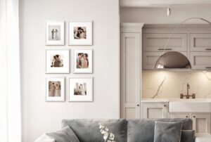
5. Perfect 3 × 3 Portrait Grid

This idea uses nine square black frames in a 3 × 3 grid. Each frame has wide white matting and a bold black-and-white portrait.
This is one of the cleanest looks you can try.
Why it works:
- Symmetry creates instant order
- White mats give each photo breathing space
- The grid keeps everything balanced
Want a gallery wall that never feels messy? This is the safest bet. It always looks sharp and structured.
6. Stair Line with Playful Frames

Here, small multi-colored frames follow the upward angle of a light blue staircase. The wall displays sketches and photos in a fun, diagonal path.
Even with different colors, the layout stays clean because:
- Frames follow one clear direction
- Sizes stay small and manageable
- The staircase line guides the eye
Ever thought a colorful gallery wall had to look messy? Not if the layout stays disciplined.
7. Long Hallway Grid

This hallway features twelve square black frames in a 4 × 3 grid, lit by two bronze picture lights.
The result feels polished and gallery-like.
Key reasons it works:
- The grid keeps everything perfectly aligned
- Matching frames create unity
- Picture lights add professional-looking focus
If your hallway feels boring, this setup fixes that fast. And yes, it makes the space feel longer and more refined.
8. Puzzle Layout Above the Sofa

This arrangement uses various black frames in a large puzzle-style layout above a modern sofa. All photos stay in a black-and-white theme.
Even with different sizes, the wall feels organized because:
- The color palette stays strictly black and white
- The layout centers around the sofa
- Spacing stays consistent
This style works when you want something more dynamic than a grid. But you still keep control through color and spacing.
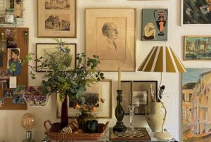
9. Mix Frames but Keep the Layout Tight

An eclectic wall doesn’t have to look messy. You can mix wood frames, black frames, photos, and small decorative pieces and still keep everything organized.
The trick lies in the layout. Keep the spacing even and let the frames follow the angle of the staircase. That simple move pulls everything together.
Here’s what makes this style work:
- Use 2–3 frame colors only
- Keep spacing between frames consistent
- Add one small decorative object for personality
IMO, the little wire heart in a setup like this makes the wall feel personal without overwhelming it. Want character without chaos? This is your move.

10. Perfect Grid for Instant Order

Nothing says clean like a grid. Sixteen identical black square frames lined up in neat rows look sharp and intentional.
A layout like this removes guesswork. Every frame has a place, and the wall feels balanced from every angle.
Why this grid works so well:
- Same frame size keeps things uniform
- Black-and-white photos reduce visual noise
- Straight rows create a calm, structured look
Have you noticed how a grid instantly makes a space feel more expensive? It’s simple, but it always works.
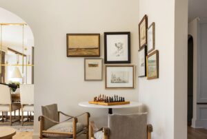
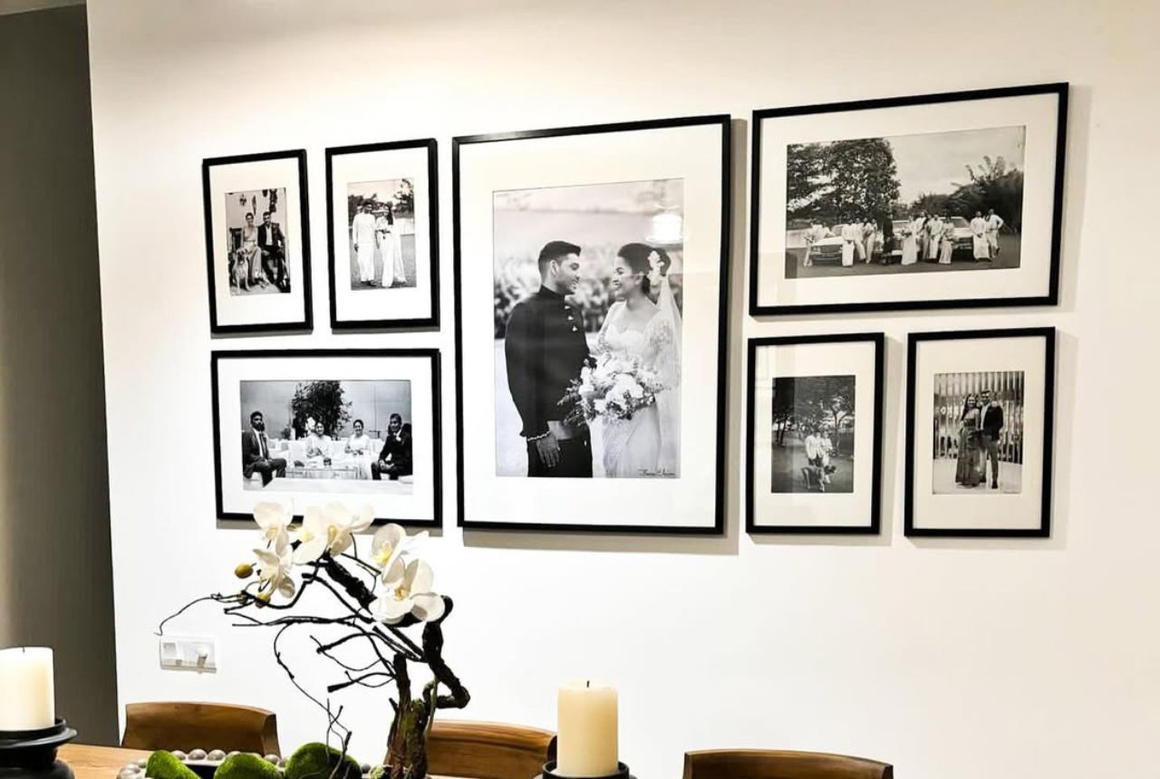
11. Black-and-White Photography

A dining room calls for something refined. A mix of black frames in different sizes holding black-and-white wedding photos creates a classy gallery wall.
The different frame sizes add interest, but the matching color palette keeps everything neat.
To keep this look organized:
- Stick to one photo style
- Use one frame color
- Space the frames evenly
This setup feels personal without being distracting. FYI, black-and-white photos always look more polished on a gallery wall.
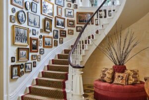
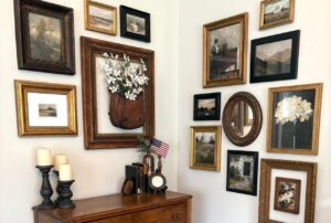
12. A Cozy, Collected Look

A floor-to-ceiling staircase gallery can feel warm and lived-in, but it still needs structure.
Mixing ornate gold frames, simple wood frames, and canvas prints creates depth and personality. But you keep it organized by following the staircase line.
Use these simple rules:
- Start from the bottom step and work upward
- Keep frame spacing consistent
- Repeat at least one frame color across the wall
Doesn’t a full staircase wall make a home feel more welcoming? It tells a story as you walk up.
13. Natural Wood Frames

If you want a calm, airy look, go for light wood frames with soft travel photos. Beach scenes, sand tones, and soft blues create a relaxed mood.
A neutral wall color helps everything blend instead of compete.
To keep this style clean:
- Choose photos with similar colors
- Use frames in the same wood tone
- Leave enough space around each frame
This setup feels peaceful, almost like a vacation memory wall. Who wouldn’t want that vibe at home?
14. White Frames for a Seamless Look

A wall full of white frames in different sizes can still feel organized. The key is the color consistency.
Even with different frame shapes, the all-white palette keeps everything looking clean and unified.
Why this works:
- One frame color keeps the wall cohesive
- Bright white reflects light and opens the space
- Different sizes add interest without clutter
Ever notice how white frames almost disappear into the wall? That’s what makes this look so smooth.
15. Simple Two-by-Three Grid Above the Sofa

A two-by-three grid of large black square frames gives you structure without overcomplicating things.
The wide white mats inside the frames add breathing room, which makes the whole setup feel clean and modern.
For this look:
- Use six identical frames
- Keep spacing equal on all sides
- Choose simple, uncluttered photos
This layout works especially well above a sofa. It fills the space without feeling heavy.
16. Picture Light for a Polished Finish

Sometimes the frames stay simple, but the lighting makes the difference. A row of black frames with oversized mats looks even better with a brass picture light above.
The light pulls attention to the gallery and makes it feel like a real design feature.
Here’s why this idea stands out:
- Oversized mats create visual breathing room
- Matching frames keep things organized
- A picture light adds a soft, elegant glow
Ever tried lighting your gallery wall? It changes the whole mood, trust me.
How to Keep Any Gallery Wall Looking Clean
No matter the style, a few simple rules keep things tidy:
- Stick to one or two frame colors
- Use a limited color palette for photos
- Keep spacing even
- Plan the layout on the floor first
I always test layouts on the floor before hanging. Saves you from ten extra nail holes. Trust me, your walls will thank you.
Easy Tricks That Make Gallery Walls Look Organized
Want a cleaner result without overthinking it? Try these:
- Use templates or paper cutouts before hanging.
- Choose matching mats for all frames.
- Align at least one edge across the layout.
- Keep a clear center point above furniture.
These small steps make a huge difference. Ever seen a gallery wall that felt “off” but you couldn’t explain why? It usually breaks one of these rules.
Conclusion
A clean picture gallery wall doesn’t need to feel stiff or boring. You just need consistent frames, balanced layouts, and a clear visual theme.
Grids give you structure. Vertical stacks fix narrow spaces. Puzzle layouts add personality without chaos. And staircase walls open the door to creative designs that still feel organized.
So which style fits your space? Start small, keep things consistent, and build from there. Before long, your walls will look polished instead of cluttered. And honestly, that small change can lift the whole room.