Small walls can feel tricky. You stare at that empty spot and wonder what could actually work there. A giant artwork looks awkward, and random pieces feel messy. But a small gallery wall can fix all that in one go.
I learned this the hard way. I once left a narrow hallway blank for months because I thought nothing would fit. Then I tried a small gallery wall, and suddenly the whole space felt styled, not forgotten. Ever noticed how a few frames can make a tight corner feel intentional instead of cramped?
And that’s the magic of small gallery walls. They don’t need much space, but they add personality fast.
20 Small Gallery Wall Ideas You’ll Love
So if you’ve got a tiny wall begging for attention, these ideas will help you turn it into something you actually love.
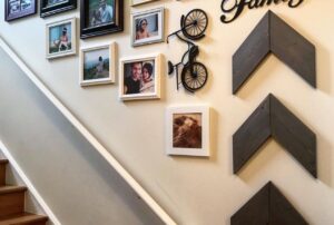
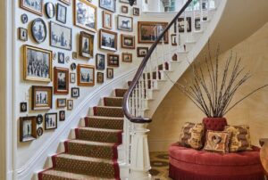
1. Follow the Stair Line for a Dynamic Look

A diagonal gallery wall along a staircase feels natural and balanced. It follows the movement of the steps, so your eye travels with it.
Black and gold frames with botanical and abstract art create a clean, modern contrast against white stairs. The look stays simple but still stylish.
Why this works so well:
- Diagonal layouts add motion to narrow areas
- Black frames create structure
- Gold accents add warmth
Ever walked up a staircase and felt like something was missing? This fixes that instantly.
2. Mix Personal Photos with Bold Art

A central blue abstract piece surrounded by family photos and desert prints creates a relaxed, layered feel. It looks collected over time, not staged.
This style works great above a sofa. It makes the seating area feel personal and welcoming.
Key tips:
- Use one bold piece as the anchor
- Mix frame styles for a casual vibe
- Keep colors somewhat connected
IMO, this is the easiest way to start a gallery wall if you feel unsure.
3. Stick to a Warm, Sunny Theme

Large Mediterranean photos paired with warm-toned illustrations create a bright, cohesive wall. Thin wood frames keep everything light and airy.
This setup pairs perfectly with mid-century furniture. The tones echo each other, so the space feels put together.
Why this look works:
- Consistent color palette
- Light wood frames soften the wall
- Larger prints make small walls feel bigger
Have you ever noticed how warm tones make a room feel instantly friendlier?
4. Create a Neat Photo Grid

A symmetrical grid of family photos feels clean and organized. White borders and light wood frames keep the display bright.
Personal captions under each photo add charm. It turns the wall into a storytelling spot, not just decoration.
Benefits of a grid layout:
- Perfect for small, square spaces
- Easy to measure and hang
- Feels tidy and intentional
FYI, grids are great if you love order and symmetry.
5. Use Moody Photography for Depth

Dark wood frames with oversized white mats give nature photos a dramatic, gallery-style feel. A balanced cluster above a bench adds coziness.
The contrast between dark frames and white mats makes each image stand out.
Why it works:
- High contrast adds visual interest
- Thick frames feel substantial
- Clustered layout keeps it intimate
Want a small corner to feel like a mini art gallery? Try this.
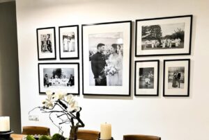
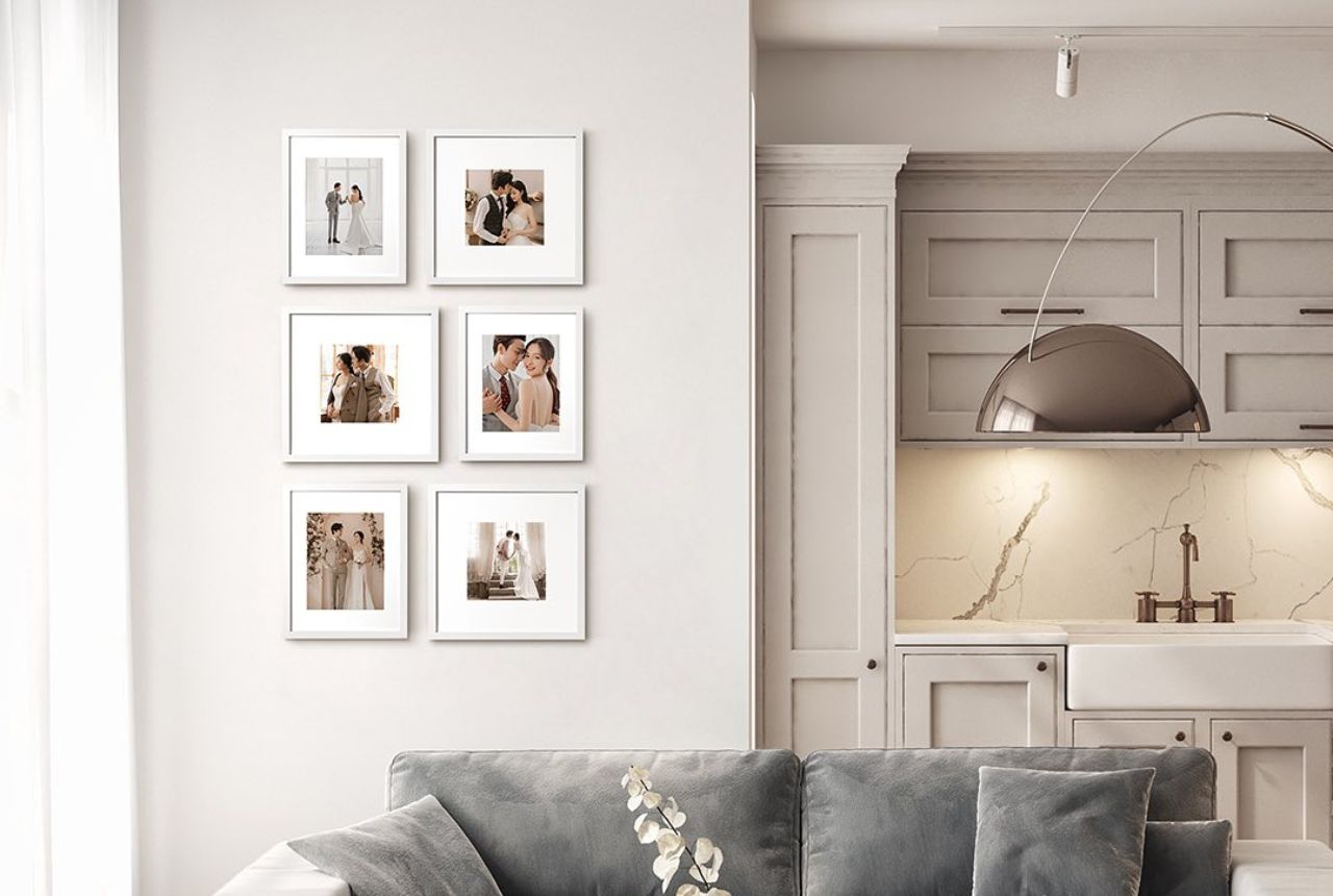
6. Go Minimal with a Perfect Grid

Six identical square frames in a 2 × 3 layout look sleek and modern. Wedding photos inside them keep the look personal but refined.

The uniform frames create a calm, minimalist effect.
What makes this layout great:
- Clean lines
- Easy spacing
- Strong visual order
Sometimes less really is more, right?
7. Layer Vintage Art for a Collected Feel

Overlapping vintage oil paintings and sketches create a rich, lived-in look. Ornate gold and dark wood frames add depth.
This style feels like the wall evolved over time. It works especially well behind a lamp or side table.
Key elements:
- Mixed frame styles
- Overlapping arrangement
- Warm, aged artwork
Love that cozy, old-world vibe? This nails it.
8. Try a Tight Coastal Cluster

Nautical watercolor paintings grouped closely above a wooden dresser create a classic coastal feel.
Different sizes keep it interesting, while the theme keeps it cohesive.
Why this works:
- Strong theme ties everything together
- Tight spacing saves wall space
- Soft colors feel calm and airy
Perfect for bedrooms or relaxed living areas.
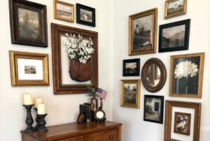
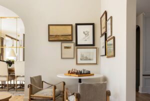
9. Keep It Simple with Three Statement Frames

Three well-spaced frames above a console create a clean, elegant look. Two black-and-white travel shots pair beautifully with a gold-framed pet portrait.
This setup proves you don’t need many pieces to make a statement.
Why it works:
- Plenty of breathing room
- Strong contrast between frames
- Simple but eye-catching
Sometimes a small wall just needs a few great pieces.
10. Hang Art with Chains for an Industrial Twist

Landscape prints suspended by black chains from metal rods create a unique, industrial-rustic look.
This setup works great above a console table. It feels creative and slightly edgy.
Why you might love this:
- Unconventional display method
- Easy to swap out artwork
- Adds texture and interest
Want something different from the usual nail-and-frame setup? This is it.
11. Use Mismatched Vintage Frames on Olive Walls

An eclectic mix of bird and botanical art instantly adds charm. When you hang them in mismatched vintage frames against olive green wallpaper, you create depth and personality.
I love this look because it feels collected, not staged. You don’t need everything to match. In fact, the magic happens when it doesn’t.
Here’s how to make it work:
- Mix frame shapes and finishes for that layered feel.
- Stick to a theme like birds or botanicals so it doesn’t look random.
- Let the olive wall act as your bold backdrop.
Have you noticed how green walls make art pop harder? That contrast does half the work for you.
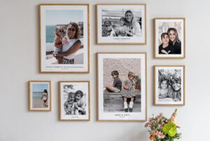
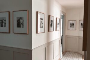
12. Go for a Clean Vertical Family Photo Stack

A narrow hallway can feel tricky. But a vertical column of six identical white frames solves that problem fast.
You line them up in a straight stack, and suddenly that awkward wall looks intentional. I’ve done this in a tight entryway, and it made the space feel taller.
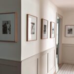
Why does it work so well?
- Uniform frames keep it clean.
- The vertical line draws the eye upward.
- Family photos add warmth without clutter.
Want a tip? Keep equal spacing between frames. That symmetry gives you a polished look without overthinking it.
13. Center Bold Posters Above Your Sofa

Three large, colorful modern posters in grey frames can anchor a vibrant green sofa beautifully. This setup screams confidence.
You keep the frames uniform. You let the art carry the drama. Simple.
I like this style because it avoids the “too many tiny frames” chaos. Instead, you:
- Choose large-scale art for impact.
- Keep frames the same color for balance.
- Center everything above the sofa.
Ever notice how oversized art makes a room feel styled by a pro? IMO, bigger often works better in small groupings.
14. Create a Cozy Vintage Cluster Around a Lamp

Now this one feels nostalgic. You arrange various-sized vintage sketches and photos around a glowing table lamp.
The lamp becomes your focal point. The art supports it.
To pull this off:
- Place the lamp first.
- Build outward with frames of different sizes.
- Keep tones warm and soft.
The glow adds mood. And the layered art creates that lived-in charm. Who doesn’t want a cozy corner like that?
15. Wrap a Minimalist Desert Theme Around a Corner

Corners often go ignored. But you can wrap light wood frames around one above a tan leather lounge and create a seamless desert vibe.
I love how this design flows instead of stopping abruptly. You continue the gallery onto the next wall. That move feels intentional and smart.
Focus on:
- Light wood frames for warmth.
- Desert-themed prints for cohesion.
- Even spacing across both walls.
Have you ever used a corner like this? It makes the space feel bigger without adding furniture.
16. Add Whimsy with Ovals and Mirrors

A cozy seating nook begs for charm. Small oval frames, tiny mirrors, and even a decorative plate can create a playful display.
This look feels collected over time. Not stiff. Not overly serious.
Here’s how to keep it balanced:
- Stick to a loose oval theme.
- Mix mirrors with art to reflect light.
- Keep the grouping tight above the seating area.
FYI, mirrors help small spaces feel brighter. That’s a win-win.
17. Go Bold with Matisse-Style Prints Above the Bed

Five colorful, Matisse-style prints in thin black frames can wake up a neutral bedroom instantly.
You loosely cluster them above the bed. You don’t over-align everything. And you let the color shine.
Why does this work?
- Thin black frames add structure.
- Bold colors energize neutral bedding.
- A loose cluster feels relaxed, not rigid.
Sometimes a bedroom needs personality. And this delivers
18. Contrast Gold and Black Frames on Dark Teal

Dark teal walls already feel dramatic. So why not lean into that?
Playful typography and botanical prints in gold and black frames pop beautifully against that deep tone.
To nail this look:
- Mix gold and black frames intentionally.
- Use playful text art for personality.
- Keep spacing consistent to avoid chaos.
Do you see how the contrast grabs attention instantly? Small gallery wall ideas shine when you embrace bold backdrops.
19. Blend Art with Plants on Floating Shelves

This setup feels organic and fresh. You nestle framed botanical art among potted plants on staggered wood shelves.
Instead of hanging everything flat, you layer art and greenery together.
Here’s why I love this approach:
- Shelves add flexibility.
- Plants soften the frames.
- Staggered heights create movement.
You can swap pieces anytime. That flexibility makes it perfect for renters.
20. Stack Black-and-White Photography Vertically

A narrow pillar can handle a clean vertical stack of four square black-and-white city prints.
This design looks sleek and modern. You keep everything aligned and evenly spaced.
It works because:
- Monochrome keeps it cohesive.
- Square prints feel structured.
- Vertical stacking saves width.
Sometimes less really does more. And this proves it.
How to Plan a Small Gallery Wall Without Stress
Before you grab a hammer, plan your layout on the floor. Trust me, that step saves you from extra holes.
Measure your wall. Keep spacing consistent. And choose a theme so your gallery feels intentional.
And ask yourself: do you want bold drama or quiet charm? Your answer guides everything.
How to Make a Small Gallery Wall Look Bigger
Small walls don’t have to feel cramped. A few smart tricks can change everything.
Try these:
- Stick to a clear color palette
- Use lighter frames to keep things airy
- Leave small gaps between frames for breathing room
- Choose a strong focal piece
A little planning goes a long way.
Common Small Gallery Wall Mistakes to Avoid
Even good ideas can flop if the layout feels off. I’ve made these mistakes myself, so trust me here.
Avoid:
- Hanging frames too far apart
- Mixing too many clashing colors
- Using art that’s too tiny for the wall
- Ignoring alignment completely
A small wall needs balance more than anything else.
Final Thoughts
Small spaces don’t limit your style. They actually force you to get creative, and that’s where the fun starts.
You can follow a staircase line, build a neat grid, or mix vintage pieces for a collected feel. The key is choosing a layout that matches your space and personality.
So look around your home. That empty corner or narrow hallway might be the perfect spot for your next gallery wall. And once you hang those frames, you’ll wonder why you waited so long.