You want a hallway gallery wall. But you don’t want chaos.
You want that effortless, “I’ve been collecting this for years” look. Not the “I panicked and filled every inch of wall space” vibe. Big difference.
I’ve helped friends style their hallways, and I’ve made my own mistakes too. I once crammed too many frames into a narrow corridor and felt overwhelmed every time I walked past it. So yeah, I learned the hard way.
12 Creative Hallway Gallery Wall Ideas
If you’re wondering how to create a hallway gallery wall that feels collected, not cluttered, you’re in the right place. Let’s break this down idea by idea.
1. Use High Contrast for a Clean, Modern Look

A black and white hallway instantly feels sharp. When you pair black frames with white walls or mix black and white wall panels, you create structure without adding noise.
In a narrow hallway, contrast works like a filter. It removes visual confusion. You let the frames stand out without crowding the space.
Add a minimalist console table underneath and place manicured greenery on top. Why? Because greenery softens the hard contrast. It adds life without clutter. Have you noticed how one simple plant can calm down a bold design choice?
If you love modern spaces, this approach keeps everything tight and intentional. Clean lines. Strong frames. No visual chaos.
2. Go for Warm Wood and Personal Photos

Want your hallway to feel cozy instead of cold? Choose light wood frames in different sizes.
When you mix frame sizes but stick to one material, you create variety without losing control. That balance keeps your wall from feeling messy.
Black and white family photos work beautifully here. They tell your story but still look cohesive. And when you place a woven rattan cabinet below, you anchor the wall with texture.
Texture matters more than people think. Wood plus rattan adds warmth. It makes the gallery feel lived-in. Ever walked into a home and instantly felt relaxed? That usually happens because of natural materials.
IMO, this setup works best if you love sentimental spaces but still want order.
3. Create a Playful “Happy Place” With Color

Now let’s talk bold.
Dark teal wainscoting sets a strong base. When you add mismatched frames, small mirrors, and vibrant art, you create energy. But here’s the trick: you must anchor the chaos.
The teal paneling does that job. It grounds everything. Without it, the wall might feel scattered.
Mixing mirrors also helps bounce light around. That keeps the space from feeling heavy. Ever noticed how mirrors make small hallways feel bigger?
If you crave personality, go eclectic. But keep one unifying element. In this case, it’s the wall color. That’s what makes it feel collected instead of random.
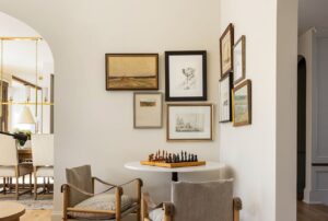
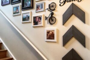
4. Add Structure With Olive Paneling and Large Art

Sometimes less truly works better.
Olive-green wall paneling brings instant sophistication. Instead of filling the wall with dozens of frames, hang large abstract canvas art in neutral tones.
Big art creates breathing room. It tells the eye where to rest. And that alone prevents clutter.
Paneling also creates built-in boundaries. The structure organizes the space for you. You don’t have to guess placement as much.
If your hallway connects busy rooms, this calm setup acts as a transition zone. Think of it as a visual exhale.
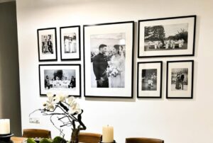
5. Keep It Linear for a Museum Feel

Uniform oversized black frames. Wide white matting. Clean white walls.
That’s how you create a museum-style hallway gallery wall.
Line the frames in a straight row. Keep equal spacing between them. The wide mats give each image breathing space, even if the hallway feels tight.
This works especially well in bright corridors. Natural light enhances the clean look. FYI, matting does more than protect art. It visually separates each piece, which reduces clutter instantly.
If you like symmetry and order, this layout feels satisfying every time you walk past it.
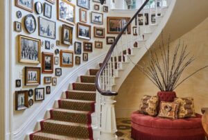
6. Try Floor-to-Ceiling Salon Style (But Do It Right)

Salon style looks chaotic at first glance. But it doesn’t have to feel messy.
Use gold and wood vintage frames in different sizes. Arrange them from floor to ceiling. Then add a simple wooden radiator shelf underneath to ground everything.
The key? Overlap slightly, but maintain visual balance. Spread larger pieces evenly. Fill gaps with smaller ones.
Ask yourself: does your eye move smoothly across the wall, or does it get stuck? If it gets stuck, adjust spacing.
When done right, salon style feels layered and curated. When done wrong, it feels like a thrift store explosion. So edit carefully.
7. Go Dense but Organized With a Grid

A floor-to-ceiling wall can still feel structured.
Choose black frames only. Fill them with illustrations or sketches. Arrange them in a tight grid.
Grids create instant order. They tell your brain, “Relax, this makes sense.”
Add a patterned runner on light wood floors to balance the density above. The floor pattern pulls attention downward and prevents visual overload.
If you love art but fear clutter, grids are your best friend. Simple rule. Repeated frames. Clear alignment.
8. Use a Botanical Theme for Calm Energy

Nature themes always work in hallways.
Pick dark bamboo frames and arrange them in a neat grid. Fill them with botanical prints. The repetition keeps things organized.
Add a traditional red runner for warmth. Let soft natural light highlight the frames.
Plants on walls feel lively but not chaotic. Why? Because the theme stays consistent. When everything relates to nature, your eye understands the story.
This works beautifully if you want calm but not boring.
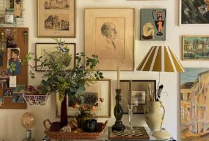
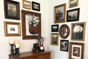
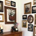
9. Embrace Vintage Drama With Restraint

Ornate gold frames. Patterned tile floors. Crown molding. A big fern in the corner.
This style screams personality. But restraint matters.
Let the architectural details do some of the work. You don’t need to fill every inch with art. Leave small breathing spaces between frames.
The large fern softens the heaviness of gold frames. Plants break up visual density. That’s important in vintage-heavy spaces.
Have you ever seen a hallway that felt too ornate? That usually happens when everything competes. Choose focal pieces. Let them shine.
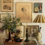
10. Go Maximalist, But Anchor It

Floor-to-ceiling art. Woven pendant lights. Rustic sideboard. Bold red geometric runner.
Maximalism can look amazing. But you need anchors.
Use the runner rug and sideboard as grounding elements. They stabilize the wall of art. Without them, the hallway might feel overwhelming.
Stick to one or two repeating colors. For example:
- Red in the rug
- Red accents in artwork
- Warm wood tones throughout
Repetition builds cohesion. Even bold spaces need rules.
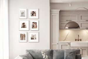
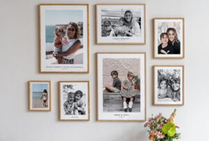
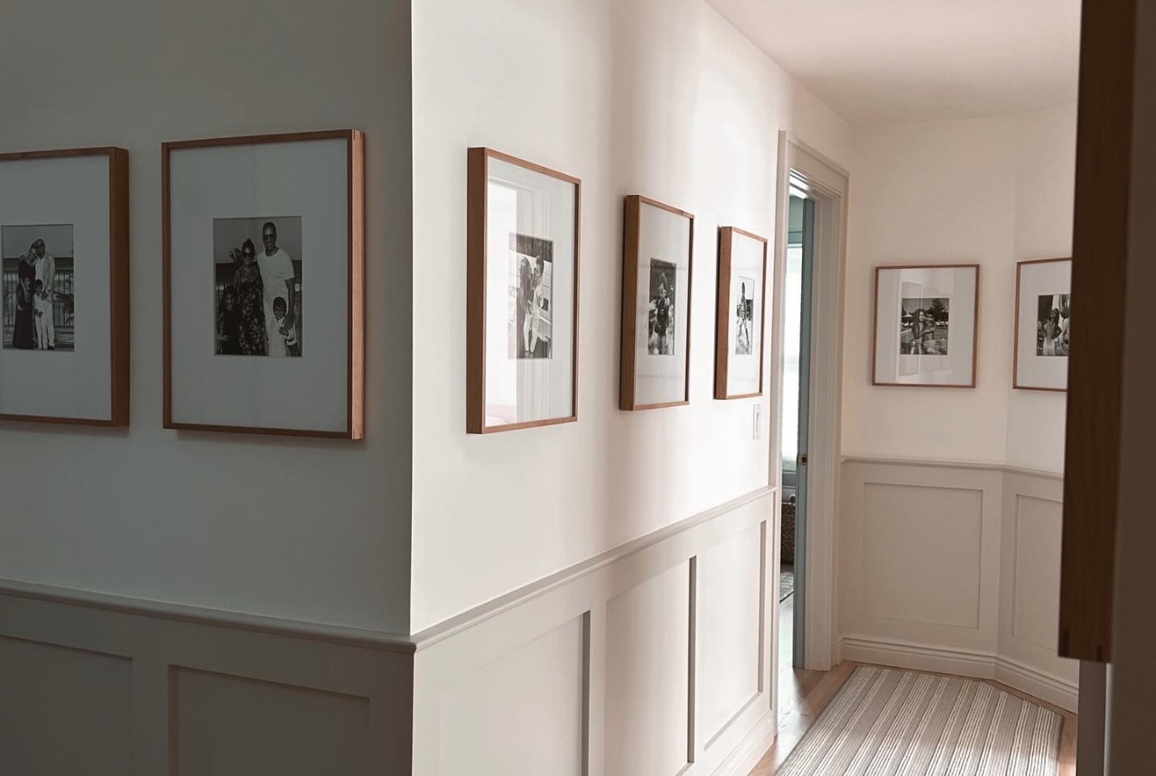
11. Keep It Minimal With Uniform Light Wood Frames

Light wood frames plus black-and-white photos create softness.
Place them above elegant white wainscoting. Add a neutral striped runner below. This layering creates structure.
Uniform frames simplify everything. No guessing. No visual competition.
If you prefer quiet design, this option feels timeless. And timeless always beats trendy clutter.
12. Balance Metallic Frames in a Bright Landing

Mixed metallic frames can feel risky. But balance makes them work.
Arrange them in a clean grid on white walls. Let light wood floors keep the space grounded.
Family photos look great here because the metals add subtle shine. Keep spacing consistent.
Want to avoid clutter? Don’t mix too many finishes. Stick to gold, silver, or bronze variations only. Keep it tight.
How to Keep Your Hallway Gallery Wall From Feeling Cluttered
No matter which style you choose, follow these rules:
- Stick to a theme (color, material, or subject).
- Repeat at least one element across all frames.
- Leave breathing room between pieces.
- Anchor the wall with furniture, rugs, or paneling.
- Edit ruthlessly. Remove what doesn’t fit.
You don’t need to display everything at once. Rotate art seasonally if needed.
Planning Tips Before You Hang Anything
Before you grab the hammer, do this:
- Lay frames on the floor first.
- Take a photo and review spacing.
- Measure your hallway width and ceiling height.
- Keep eye level around 57–60 inches from the floor.
Small prep saves big regret. Trust me.
Final Thoughts
Creating a hallway gallery wall that feels collected, not cluttered comes down to one thing: intention.
Choose a direction. Repeat elements. Leave space. Anchor the design.
Whether you love bold maximalism or quiet minimalism, structure keeps everything balanced. So step back and ask yourself, does this feel curated or crowded?
Start small. Adjust as you go. And remember, your hallway should feel like a story, not storage.
Ready to transform that empty corridor?