You walk up your stairs every day, but does that wall say anything about you? Or does it just sit there, plain and forgettable? A smart gallery wall staircase can turn that empty stretch into the most personal spot in your home.
I once ignored my staircase wall for years. Then one weekend, I hung a few family photos there. The space changed fast. Guests noticed it right away, and honestly, I started enjoying the climb upstairs a lot more. Funny how a few frames can do that, right?
18 Eye-Catching Gallery Wall Staircase Decor
A gallery wall staircase works because it sits in a high-traffic zone. Everyone sees it. So why not use it to show your style, your memories, and the things you love? Let’s walk through some ideas that feel personal, not staged.
1. Use Clean Black Frames for a Calm, Botanical Look

If you like order and simplicity, this idea works well. Picture uniform black frames holding soft botanical sketches, arranged in a neat, staggered line above wall molding.
This setup feels calm and organized. It doesn’t shout for attention, but it still looks polished and intentional.
Why this style works:
- Uniform frames create visual balance
- Botanical art adds a soft, natural touch
- The staggered layout follows the movement of the stairs
IMO, this works great in smaller homes. It keeps the space interesting without making it feel busy. Have you ever noticed how too many frame styles can feel chaotic?
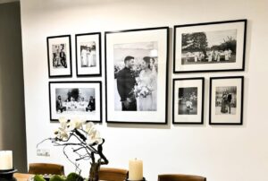
2. Line the Staircase with Black-and-White Family Portraits

Nothing feels more personal than family photos. Using large black frames with black-and-white portraits gives the staircase a timeless feel.
The curved line of the staircase naturally guides the eye from one photo to the next. It almost feels like a visual story.
Here’s why this approach stands out:
- Black-and-white photos look classic and elegant
- Large frames make each portrait feel important
- The layout follows the curve of the staircase
I tried this once with old childhood photos. Some were funny, some were awkward, and one had my terrible haircut phase. Guests loved it. And honestly, it sparked a lot of good conversations.
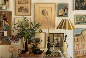
3. Mix Frame Styles for a Warm, Collected Look

If you hate things that look too perfect, this one’s for you. An eclectic mix of wood, white, and ornate gold frames creates a relaxed, collected vibe.
It feels like you’ve gathered pieces over time instead of buying everything in one go.
This approach works because:
- Mixed frames add depth and character
- Different sizes keep the eye moving
- The look feels personal and lived-in
FYI, thrift stores are gold mines for this style. I once found a vintage frame for almost nothing, and it became the highlight of the wall.
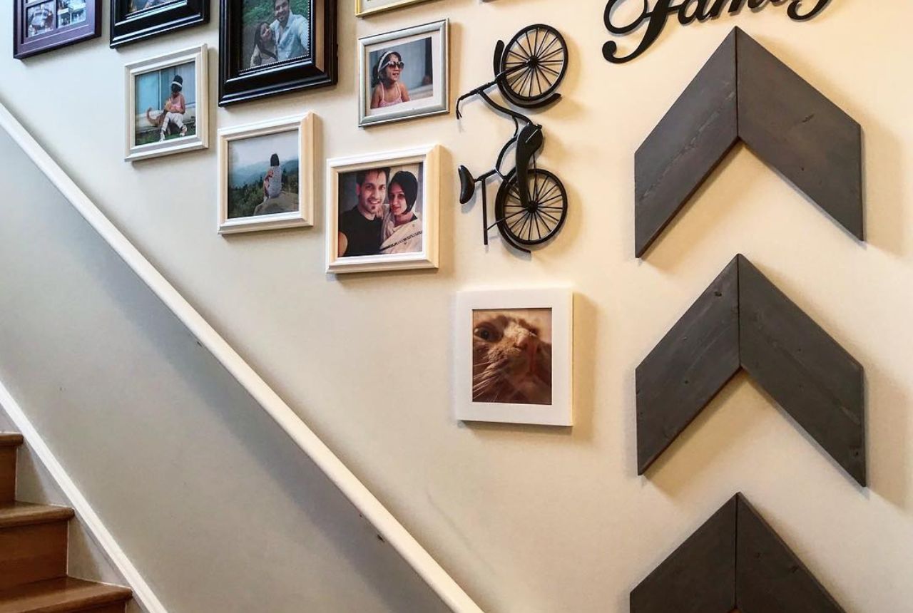
4. Add 3D Elements for a Playful Family Wall

Who says a gallery wall must be flat? You can mix photos with 3D decor pieces like metal shapes, wooden letters, or small sculptures.
Imagine photos paired with:
- A “Family” wall sign
- A small metal bicycle
- Large wooden chevron shapes
This setup feels fun and casual. It’s perfect for homes with kids or anyone who wants a lighter, playful tone. Doesn’t a wall like this feel more alive than a row of stiff frames?
5. Go Floor-to-Ceiling with a Salon-Style Display

If you love bold, artistic spaces, try a floor-to-ceiling salon-style gallery wall. This means filling the wall with art from the bottom step all the way up.
Pair that with a vibrant stair runner, and the whole staircase turns into a statement area.
Key benefits of this style:
- Creates a dramatic visual impact
- Lets you mix art styles freely
- Makes the staircase feel like a gallery
This works best in homes with tall walls. Otherwise, it can feel cramped. But when done right, it looks amazing.
6. Center Large Classical Paintings for a Formal Feel

If your home leans traditional, try a symmetrical arrangement of large classical oil paintings along the staircase.
This setup feels formal and refined. Each piece stands out because the layout stays clean and balanced.
Why this style works:
- Symmetry creates a calm, elegant look
- Large art pieces feel more luxurious
- Neutral walls help the paintings shine
This style reminds me of old houses with grand staircases. It feels timeless, almost like walking through a small museum.
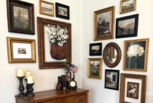
7. Use Vintage Gold Frames for Classic Charm

Vintage gold frames never go out of style. Pair them with ornate mirrors above white wainscoting, and you get a staircase that feels rich and classic.
The mirrors also help bounce light around, which brightens the space.
What makes this idea smart:
- Gold frames add warmth and elegance
- Mirrors make the area feel bigger
- The mix of art and mirrors adds depth
Ever walked into a home where the staircase felt brighter than the rest? Mirrors usually play a big role in that effect.
8. Go Bright with Colorful Graphic Art

If you love modern design, try a collection of colorful graphic art and illustrations in mismatched frames.
Use black, white, and wood frames to keep the look grounded while the artwork brings in the energy.
This idea works because:
- Bold colors add personality and fun
- Graphic art feels fresh and modern
- Mixed frames keep the look relaxed
This style suits creative homes. It feels young, lively, and a bit daring. And honestly, why keep things boring?
9. Mix Vintage Frames for a Relaxed Nautical Look

This setup uses vintage nautical and landscape paintings in mismatched wooden frames. The arrangement feels organic, almost like it grew there over time.
IMO, this style works best when you stop trying to match everything. Let the frames differ in tone, size, and texture. That’s what gives it charm.
Try this approach:
- Use old maps, boats, or coastal landscapes
- Mix dark and light wood frames
- Let the layout follow the stair angle naturally
And that brass wall sconce? It adds warmth and a hint of old-world character.
10. Go Vertical With Bold Abstract Prints

Here, four colorful abstract prints stack neatly in a vertical line. The look feels clean, modern, and super easy to pull off.
This idea works great if you hate clutter. Just pick four strong pieces and let them shine.
Keep it simple:
- Choose one color palette across all prints
- Use the same frame for each piece
- Align them carefully for a sharp look
Ever notice how a single vertical line can make a space feel taller? That’s the trick here.
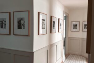
11. Follow the Stair Line With Uniform Frames

This layout uses identical black frames arranged along the diagonal line of the stairs. The effect feels calm, balanced, and a bit sophisticated.
I tried this in a client’s home once, and the result looked instantly polished. No guessing. No chaos. Just clean rhythm.

For best results:
- Use matching frames for consistency
- Keep equal spacing between pieces
- Let the arrangement mirror the stair slope
Simple choices often create the strongest impact.
12. Fill the Wall With Family Memories

This idea covers the wall from floor to ceiling with family photos in light wood frames. The green garland adds a playful, festive touch.
FYI, this style feels warm because it tells a story. Every step up the stairs becomes a little walk through your memories.
To keep it from looking messy:
- Stick to one frame color
- Use a mix of portrait and landscape photos
- Add a seasonal accent like garland or lights
Who wouldn’t smile walking past those faces every day?
13. Add 3D Pieces for Texture and Depth

This staircase mixes nature photography with three-dimensional objects like a wooden propeller and industrial sconces.
This idea feels creative and slightly unexpected. And honestly, that’s what makes people stop and look.
Try combining:
- Framed nature or travel photos
- Small sculptural objects
- Wall lights for depth and shadows
Flat art looks nice. But a little texture makes the wall feel alive.
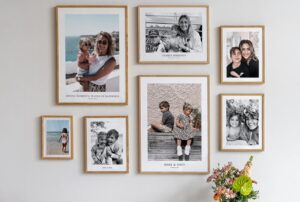
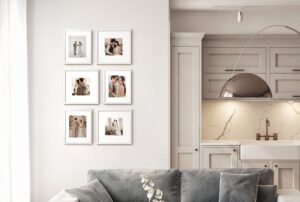
14. Use Oversized Portraits for a Clean Grid

This design uses large black-and-white family portraits arranged in a neat grid. The light wood frames keep the look soft and airy.
Big photos create instant impact. You don’t need dozens of frames when you go large.
For a similar look:
- Choose high-quality, oversized prints
- Use thin, light frames
- Keep the spacing even
Ever notice how large portraits feel more emotional? You see every detail, every expression.
15. Create a Calm Botanical Block

This gallery focuses on black-and-white leaf prints in matching oak frames. The layout forms a structured block on the landing.
This style feels peaceful. Almost spa-like.
To copy the look:
- Pick one theme, like botanical or nature
- Use identical frames
- Arrange them in a tight, square layout
Sometimes a simple theme creates the strongest personality.
16. Go Eclectic With Colorful Posters and Plants

This wall goes bold with vintage posters, travel prints, and hanging plants. The navy staircase adds drama.
This style feels playful and full of energy. Perfect if your home leans creative.
For a similar vibe:
- Mix bright posters and prints
- Add small hanging plants
- Use a darker stair color for contrast
Why keep things safe when you can make the space fun?
17. Build a Balanced Layout Around a Focal Point

Here, black-and-white photos sit in black frames along the stairs. Two larger portraits act as the centerpieces.
This approach feels organized without looking stiff. The focal pieces guide the eye.
Try this method:
- Pick one or two larger photos first
- Arrange smaller frames around them
- Keep spacing consistent
A clear focal point always makes the wall feel intentional.
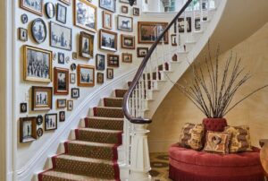
18. Try a Nostalgic Salon-Style Gallery

This setup packs the wall with family photos in gold and wood frames. The striped stair risers add extra personality.
Salon-style walls feel cozy and layered. They remind me of old family homes where every frame had a story.
For this look:
- Mix frame sizes and finishes
- Hang pieces closer together
- Add patterns or color on the stair risers
It feels busy, but in a warm, lived-in way.
Simple Layout Rules That Always Work
You don’t need a design degree. Just follow a few basics.
- Match the stair angle with your layout
- Keep spacing consistent
- Use one unifying element, like frame color or theme
- Lay everything out on the floor first
These small steps save you from crooked frames and regret later
How to Make Your Gallery Wall Feel Personal
A gallery wall staircase works best when it reflects your life, not just a trend.
Keep these tips in mind:
- Mix memories with art so the wall tells a story
- Choose a consistent color palette for the frames
- Follow the angle of the staircase for a natural layout
- Start small, then add pieces over time
Your wall should grow with you. That’s what makes it feel real.
Common Mistakes to Avoid
Even a great idea can look off if you rush it.
Watch out for these:
- Hanging frames at random heights
- Mixing too many frame colors without a plan
- Using art that means nothing to you
- Leaving awkward empty gaps
A little planning saves you from a wall that feels messy.
Final Thoughts
A smart gallery wall staircase turns a simple walkway into a personal story. You can keep it calm with botanical sketches, go bold with salon-style art, or fill it with family memories.
The best part? There’s no single right way to do it. Your staircase should reflect your taste, your memories, and your life.
So next time you walk up those stairs, ask yourself this: Does this wall say anything about me? If not, maybe it’s time to start hanging some frames.