You know that blank wall that keeps staring at you? Yeah, that one. It’s basically begging for a glow-up. A family gallery wall fixes that fast and adds real personality to your space.
I’ve played around with more gallery walls than I can count. Some worked beautifully. Others… well, let’s just say the nail holes still haunt me. But once you get the layout right, your home instantly feels warmer and more personal.
20 Family Gallery Wall Ideas for Your Home
So if you want picture perfect family gallery wall ideas for your home, you’re in the right place. Let’s walk through smart, stylish setups that actually work in real homes.
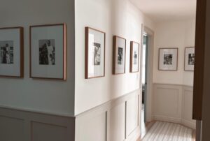
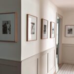
1. Use a Clean Vertical Wood Frame Grid

If you love order but still want warmth, try a vertical grid with medium-toned wood frames. This setup keeps things tidy while the wood finish softens the overall look.
The black and white photos with wide white matting create strong contrast. And placing this near a doorway or staircase makes the wall feel intentional instead of random. Have you noticed how grids instantly make a space feel more polished?
Why this works so well:
- Vertical layout saves space in narrow areas
- Wood frames add warmth to off-white walls
- Wide matting highlights each photo clearly
IMO, this style works great if you want something timeless without overthinking it.
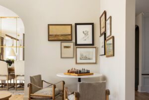
2. Go for a Symmetrical Statement Grid

Want your wall to look straight out of a magazine? A 12-frame symmetrical grid with thin black frames does the job fast.
The landscape photos keep the layout calm and balanced. But the real magic comes from the brass picture lights above the display. They turn simple family photos into a mini art exhibit.
And pairing the wall with a potted olive tree and plaid ottomans grounds the whole setup. Ever noticed how lighting alone can make photos look expensive?
Key tips to copy this look:
- Keep spacing perfectly even
- Use matching frame sizes
- Add picture lights for drama
- Style the area below the wall
FYI, this layout works best on large, open walls where symmetry can shine.
3. Create Drama with Large Portrait Frames

Sometimes bigger really is better. Large-scale black and white portraits in thin black frames create instant impact.
This style works beautifully near dining areas. The bold portraits balance nicely with black spindle chairs and a wooden table. And that geometric chandelier overhead? It ties everything together.
Ask yourself this. Do you want guests to politely notice your wall… or actually stop and stare?
Why you might love this setup:
- Large photos feel personal and bold
- Vertical portraits add height to the room
- Black frames keep the look modern
I use this trick whenever a space feels flat and needs some visual weight.
4. Try a Floating Layered Frame Wall

Okay, this one feels fancy. The interlocking floating gallery wall mixes black and gold frames with transparent glass backgrounds.
Because the photos appear suspended, the whole wall feels light and modern. It avoids that heavy, crowded look many gallery walls suffer from.
But heads up. This style needs careful spacing. If you rush it, the wall can look messy fast.
What makes this layout stand out:
- Mixed frame finishes add depth
- Glass backgrounds create an airy feel
- Layered placement adds movement
- Works great in modern homes
If you like contemporary design, this one hits different.
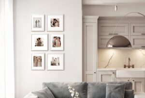
5. Keep It Sleek Above a Console Table

Sometimes simple wins. A uniform six-frame black grid above a sleek console table looks clean and intentional.
The three linear gallery lights do heavy lifting here. They highlight the photos and create that soft museum vibe. And the small green sprig adds just enough life without clutter.
Have you ever noticed how a styled console instantly makes a gallery wall feel complete?
Quick styling wins:
- Use identical frame sizes
- Center the grid above the table
- Add lighting for focus
- Keep decor minimal
This setup works great in entryways and hallways.
6. Add Depth with Wide Matting

This grid uses nine oak-finish frames, but the real star is the extra-wide coffee-colored matting.
Wide mats make even small photos feel important. They also create breathing room so the wall doesn’t feel cramped. Mounting the frames above a light wood floating shelf adds another layer of interest.
Why wide matting works:
- Makes small photos look premium
- Adds visual spacing
- Creates a soft, layered effect
- Pairs well with warm wood tones
IMO, this trick works wonders if your photos vary in quality.
7. Go Airy with an Asymmetrical Cloud Layout

If grids feel too stiff, try a cloud-style gallery wall. Light wood frames in mixed sizes create a relaxed, organic vibe.
This layout shines in bright living rooms. The neutral sofa, textured pillows, and dried palm leaf help the wall feel soft and welcoming.
But be honest. Don’t you love a gallery wall that looks effortless even when it’s carefully planned? 🙂
Tips to nail this look:
- Start from the center and build outward
- Mix frame sizes thoughtfully
- Keep spacing visually balanced
- Stick to a light color palette
This style feels casual but still pulled together.
8. Wrap the Wall with a Corner Gallery

Want maximum impact? A floor to ceiling corner gallery wall delivers big time.
Using black frames in different sizes keeps the display interesting. Mixing vintage and modern black and white photos adds personality and history.
Wrapping the gallery around a dining nook also makes the space feel cozy and intentional.
Why this layout works:
- Uses vertical space fully
- Makes small areas feel designed
- Adds storytelling through mixed photos
- Creates a true focal point
This one takes patience, but the payoff looks amazing.
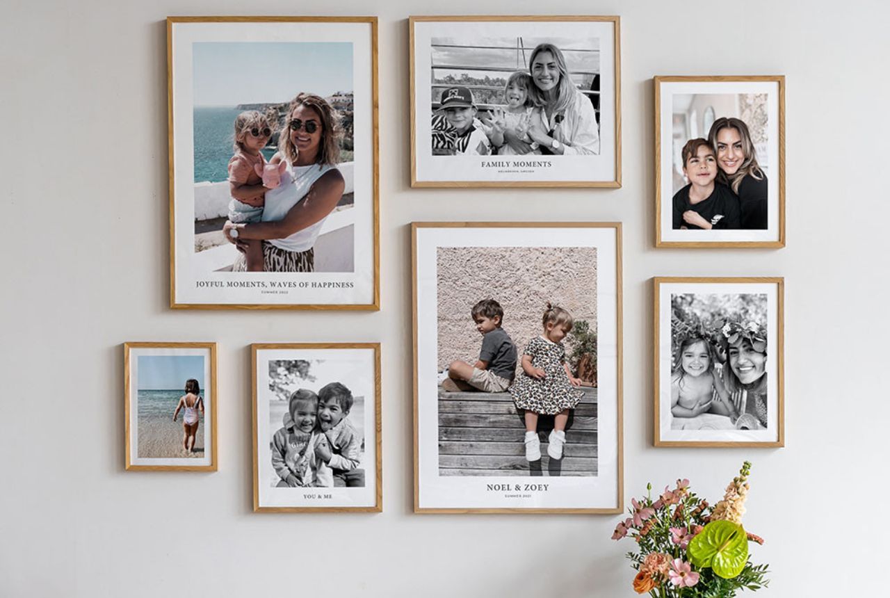
9. Mix Orientation for a Custom Feel

Here’s a smart move. Use mixed-orientation oak frames and add custom text under some photos.
That small detail makes the gallery feel deeply personal. Placing the wall above a woven bench with a white throw softens the overall look.
Ever thought about adding dates or short captions to your family photos? It changes everything.
Smart styling ideas:
- Combine portrait and landscape shots
- Add subtle captions
- Keep frame color consistent
- Style the bench below
This approach feels meaningful without looking busy.
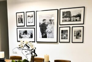
10. Stick with a Classic Square Grid

Sometimes the classics win for a reason. A grid of black square frames with wide white matting always looks clean.
The sepia-toned photos add warmth, especially against a textured neutral wall. And that moment of a child reaching toward the display? Pure magic. It reminds you why family gallery walls matter in the first place.
Why this style never fails:
- Easy to measure and hang
- Works in almost any room
- Feels timeless
- Highlights family moments clearly
If you feel unsure where to start, begin here.
11. Create a Floor to Ceiling Family Statement

Want serious wow factor? Go big and go tall.
This floor to ceiling collage of white and gold frames surrounds a central window, and honestly, it feels like walking into a memory museum. The mix of portrait sizes keeps the display lively instead of stiff.
Why this works so well:
- White and gold frames keep the large display cohesive
- Mixed portrait sizes add movement and visual interest
- Central window anchor prevents the wall from feeling chaotic
That toddler in the space shows the scale clearly. IMO, if you have a tall wall or stair landing, this bold approach fills the space beautifully without looking empty.
12. Go for a Clean 3 by 3 Grid

Sometimes simple wins. Actually, it wins a lot.
This symmetrical 3 by 3 grid of identical black frames delivers a clean, modern look that never goes out of style. The black and white portraits keep everything calm and focused.
Use this layout when you want:
- A minimalist family gallery wall
- Easy alignment and spacing
- A polished hallway display
Have you ever noticed how grids instantly make a space feel organized? That’s the magic here. FYI, grids also make future photo swaps super easy.
13. Add Drama with a Dark Accent Wall

If you love bold interiors, this setup hits different.
The white-matted black frames pop hard against the black accent wall. Add the emerald sofa and warm lighting, and suddenly the gallery feels high-end and intentional.
What makes this look elevated:
- High contrast wall color for visual impact
- Consistent frame style to avoid clutter
- Warm lighting to soften the dark backdrop
But here’s the key. You must keep the photos cohesive. Random colors would ruin the mood fast. Stick with black and white for that gallery-level finish.
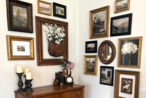
14. Build a Vintage Memory Corner

Okay, this one feels like grandma’s house in the best way possible.
The mix of ornate gold, oval, and dark wood frames on the dusty blue wall creates a cozy, collected-over-time vibe. The clock, antique key, and wall vase add layers of personality.
Steal these styling tricks:
- Mix frame shapes and finishes carefully
- Add small vintage objects for depth
- Ground the wall with a bench or furniture piece
Do you need every piece to match? Nope. In fact, the charm comes from the mix. Just keep the color palette tight so it doesn’t look messy.
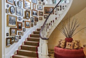
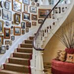
15. Layer Frames for a Rich Stairwell Look

This dense, overlapping gallery leans into controlled chaos.
Gold and dark wood frames stack closely together, filled with intimate black and white child portraits. The modern gold lantern in front adds depth and a bit of drama.
Why overlapping works here:
- Creates a collected, gallery-style feel
- Maximizes narrow stairwell space
- Keeps the eye moving across the wall
But be careful. Too much overlap without a plan looks sloppy fast. Measure first. Trust me on that.
16. Let Your Gallery Flow with the Stairs

This layout feels relaxed and natural, almost like the wall grew this way.
Wood, white, and gold frames cascade down the staircase line. The sunburst mirror and ceramic wall pocket break up the photo repetition nicely.
This approach works best when you:
- Follow the natural staircase angle
- Mix decor pieces with photos
- Vary frame sizes for movement
Have you tried forcing frames into a straight line on stairs? It usually looks off. Let the architecture guide you instead.
17. Stretch the Look Down a Long Hallway

Long hallways beg for a proper gallery wall. Otherwise they feel like tunnels.
This soft slate blue wall carries a sophisticated mix of black, silver, and gold frames down the corridor. The runner rug and pendant lights pull the whole look together.
Key hallway gallery tips:
- Keep frame spacing consistent
- Repeat finishes for cohesion
- Use lighting to highlight the wall
IMO, hallways handle mixed metals better than small spaces. The length gives your eye room to breathe.

18. Use Picture Lights for a Polished Grid

Now this looks straight out of a design magazine.
The perfectly aligned 3 by 4 grid sits under sleek bronze picture lights, and the effect feels professional and intentional. The leather ottomans below ground the display nicely.
Why picture lights matter:
- Highlight your family photos like artwork
- Add warm, focused lighting
- Instantly elevate simple frames
Have you ever seen photos look flat on the wall? Proper lighting fixes that fast.
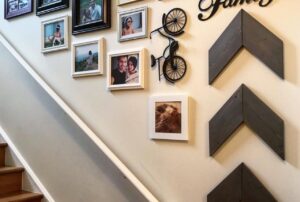
19. Stagger Frames to Add Height

Short wall? Low ceiling? This trick helps.
The vertical staggered layout of thin gold and silver frames draws the eye upward. Suddenly the ceiling feels higher without any renovation drama.
Use vertical staggering when you want to:
- Make ceilings appear taller
- Fill narrow wall spaces
- Add subtle movement
The rustic bench and red rug add warmth so the white wall doesn’t feel cold. Smart move.
20. Keep It Light with an Airy Cluster

If you prefer calm over clutter, this one feels refreshing.
The minimalist cluster uses natural wood, white, and gold frames with generous white matting. The small family photos suddenly feel like fine art.
What keeps this look clean:
- Plenty of white space between frames
- Consistent light color palette
- Smaller, curated photo selection
Sometimes less really does more. And yes, this setup proves it.
Common Mistakes to Avoid
Even beautiful frames can look wrong with poor execution.
Watch out for these pitfalls:
- Hanging frames too high
- Mixing too many frame finishes
- Ignoring lighting
- Overcrowding small walls
- Using low quality photo prints
The biggest mistake? Rushing the layout. Take your time and your wall will thank you.
How to Choose the Right Gallery Wall Style
Before you grab a hammer, pause for a second. The best family gallery wall ideas for your home depend on your space and vibe.
Ask yourself:
- Do I prefer clean grids or relaxed layouts?
- Does my room need warmth or drama?
- How much wall space do I actually have?
- Do I want the wall to feel modern or timeless?
Your answers will guide you faster than any design rule.
Simple Tips to Make Your Gallery Wall Look Professional
Want that polished look without hiring a designer? Keep these in mind.
Must follow tips:
- Measure twice before hanging
- Lay frames on the floor first
- Keep spacing consistent
- Use proper wall anchors
- Stick to a clear color story
Trust me. These small steps save major frustration later.
Final Thoughts
A great family gallery wall does more than fill space. It tells your story every single day.
Whether you love clean grids, vintage mixes, or relaxed stair layouts, the key stays the same. Stay consistent, plan your spacing, and choose photos that actually mean something to you.
So which style fits your home best? Start small if you feel unsure. But once you see those memories on the wall, you might just get hooked.