
Nothing kills the vibe of a beautiful dining room faster than a big, empty wall staring at you while you eat. You’ve got the table, the chairs, maybe a cute centerpiece… but the wall? Just there, doing absolutely nothing. That’s where a dining room gallery wall comes in — it’s the perfect way to turn that blank space into something that actually feels alive.
And here’s the best part: you don’t need an interior design degree or an unlimited budget. All you need is a little creativity, a few frames, and maybe a touch of courage to hammer that first nail. (FYI, painter’s tape is your best friend here.)
18 Dining Room Gallery Wall Ideas That Instantly Transform Your Space
I’ve seen gallery walls completely change a dining room’s personality — from formal and polished to relaxed and personal. So grab your coffee (or wine) and let’s talk about how you can pull this off without losing your sanity.
1. The Symmetrical Statement

If you’re the kind of person who likes their books alphabetized and their throw pillows perfectly fluffed, you’ll love a symmetrical gallery wall. This look thrives on balance — think two large pieces or a grid of evenly spaced frames that line up like soldiers.
Symmetry instantly gives your dining room a sense of calm and confidence. Use structured art, like abstract prints or minimalist line drawings, and frame them in matching tones (gold or black frames always nail the look).
Pro tip: anchor the setup with a bold chandelier or a piece of furniture underneath — something that gives your wall a sense of gravity. The result? Elegant, intentional, and totally satisfying to look at.
2. The Maximalist Mix-Up

Now, for those who think rules are more like “suggestions” — welcome to the maximalist dining room gallery wall. This one’s all about telling your story. Mix family photos with flea-market finds, throw in a vintage mirror, maybe even a random antler if that’s your thing (no judgment).
The secret to making this controlled chaos work is consistency in spacing — even if your art is wild, keep the gaps even. It tricks the eye into thinking, “Oh wow, this person is creative,” instead of “Wow, this person needs a hobby.”
And remember, maximalism isn’t about clutter — it’s about personality. If it makes you smile, it deserves a spot on that wall.
3. Rustic Repurposed Charm

Love the cozy, farmhouse vibe? Try creating a gallery wall using repurposed materials — like an old window frame, reclaimed wood, or weathered shutters as part of the display. It’s rustic, grounded, and beautifully imperfect.
Pair landscape photos or nature-themed prints with wood and metal textures. A few benches and a pine table nearby will tie it all together. The charm here lies in authenticity — it doesn’t need to be polished; it just needs to feel real.
Ever walked into a room and instantly felt at home? That’s the rustic gallery wall magic right there.
4. Sleek and Structured

If your heart beats faster around clean lines and modern furniture, go for a structured grid layout. Six or nine frames in a tidy formation — equal spacing, sharp corners, no surprises.
Choose black-and-white photos or minimalist art with gold frames to add just enough shine. This layout pairs beautifully with modern dining tables and upholstered chairs.
Here’s the trick: hang the center of your gallery about 57 inches from the floor — that’s the average human eye level. It makes everything feel perfectly placed (and it’s one of those sneaky design “rules” that actually works).
5. Modern Minimalist Grid

For the calm souls who crave simplicity — this is your wall. A minimalist grid of small, uniform photos instantly brings order and harmony to your space.
Stick to a cohesive theme — travel moments, black-and-white portraits, or even abstract sketches. The beauty of this setup is how uncluttered it feels. Add a mirror on the opposite wall or subtle pendant lights to reflect light and balance the composition.
Minimalism in a dining room works wonders — it lets your meals (and conversations) be the main event. Because, honestly, do we really need our walls yelling for attention while we eat?
6. Classic Texture Play

Want that timeless, designer look? Pair your gallery wall with a textured backdrop. Grasscloth, beadboard, or paneled walls add a layer of sophistication that plain paint just can’t match.

Then, mix different frame shapes or even materials — wood, ceramic, or metallic finishes. You can even combine artwork and sculptural elements, like hanging plates or pottery alongside framed prints.
The trick is restraint. Let the texture do some of the talking, and let your frames complement rather than compete. A soft, warm lighting setup pulls the whole look together beautifully.
7. Dark & Moody Drama

If you’re into moody interiors — you know, dim lights, candlelit dinners, maybe some jazz playing — this one’s for you.
A dark-toned gallery wall against charcoal or navy wallpaper can make your dining room feel like a scene from a modern period drama. Use small vintage paintings in gold or wood frames to give the wall depth and richness.
Don’t be afraid of darker tones. They create intimacy and make art pop. Pair it with warm lighting or a wooden table to stop it from feeling too heavy. Bonus: everything looks fancier when the lights are low.
8. High-Contrast Chic

If drama is your thing, but you want it clean and modern, go for high contrast — black frames on white walls, white mats around dark photos, brass picture lights gleaming overhead.
This aesthetic thrives on opposites — dark vs. light, sleek vs. rustic. A high-contrast gallery wall instantly elevates your dining space and gives it that editorial look (you know, the kind you see on Pinterest and whisper “goals”).
Keep the rest of your decor minimal. A simple wooden table and dark chairs are enough to let the wall shine — literally and figuratively.
9. Eclectic Elegance

For the brave and creative, an eclectic gallery wall is where you get to break every rule… stylishly. Mix abstract art, vintage sketches, mirrors, even framed objects like pressed flowers or butterfly prints.
To make it work, find one unifying detail — maybe color, frame tone, or subject matter — that subtly connects everything. This creates a sense of intentional chaos (which, IMO, is the best kind).
Eclectic spaces feel personal and alive. They evolve over time as you add new finds, making your dining room a visual diary instead of just a decorated space.
And honestly? It’s impossible to get bored with a wall that constantly tells new stories.
10. Cozy Culinary Corner

Ever notice how the best dinner parties end up in the kitchen or that little breakfast nook? A cozy dining corner deserves art that feels just as inviting. Try hanging a short, linear gallery—three or four small food-themed paintings, maybe fruit still-lifes or rustic café sketches.
Keep the frames light and natural to match the casual vibe. The trick here is restraint: let the art echo the warmth of the space instead of shouting over it. Add warm pendant lighting above the table (bonus points if the bulbs are dimmable) and—boom—you’ve got a nook that practically whispers come eat here.
11. Scandinavian Simplicity

If you’re into neutral tones, natural textures, and that uncluttered “I-just-breathed-out” feeling, go Scandinavian. A simple ledge gallery with black-framed sketches or line drawings keeps things low-key yet refined.
Rest the art casually on a wainscoting ledge instead of hanging it—instant design cred with zero holes in the wall. Pair this with cozy elements like a bench draped in a sheepskin throw or a linen tablecloth for softness.
This look thrives on imperfection. A slightly tilted frame? Charming. A visible nail? Authentic. It’s laid-back design confidence, Nordic-style.
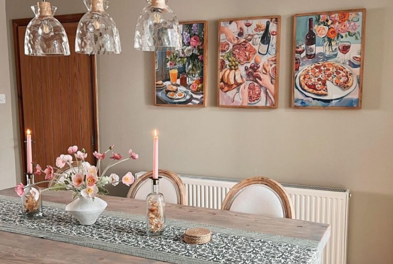
12. The Transitional Trio

Can’t decide between modern and traditional? Congratulations—you’re transitional! A triptych of abstract landscapes gives you structure without feeling stiff. It bridges classic and contemporary like it’s no big deal.

Use three panels of similar size, spaced evenly, centered right over the table. Neutral color palettes—black, white, gray, maybe a smudge of ochre—keep it calm and cohesive. Add a modern chandelier to tie it all together.
FYI, triptychs are magic for awkwardly long dining walls. They fill space beautifully while keeping the design controlled and elegant.
13. Minimalist Monochrome Magic

Here’s where less truly is more. A pair of oversized, sculptural paper-cut artworks in simple wooden frames can do more for your dining wall than a dozen small prints.
White-on-white textures or subtle reliefs look sophisticated, airy, and quietly confident. Surround them with natural materials—oak, linen, rattan—to keep the palette soft. The result? A gallery wall that whispers rather than shouts.
This setup proves you don’t need color to make an impact; you just need texture and good lighting. Think of it as the visual equivalent of a deep breath.
14. Serene & Balanced

If you love symmetry but don’t want your space to feel uptight, balance two artworks—one abstract, one landscape—on either side of a central feature like a doorway or mirror.
This two-piece symmetry gives your dining room polish without being predictable. Choose tones that echo your wall color—sage, taupe, or muted blues—to create flow. Pair with warm wood furniture and soft-glow lighting for a serene, spa-like mood.
Design-wise, it’s the visual equivalent of good manners: elegant, effortless, and never overbearing.
15. Family Focused

A dining room is where stories are swapped, jokes land badly, and someone always spills the gravy—so why not celebrate that? A family photo gallery wall turns your space into a living memory book.
Stick with a consistent frame style (thin black or wood works great) and convert photos to black-and-white for a unified, timeless look. Arrange them in a symmetrical grid so it feels intentional, not chaotic.
You’re not just decorating—you’re storytelling. Guests will inevitably pause mid-bite to point and laugh at that awkward vacation photo. That’s the charm.
16. Timeless Tradition

If you prefer something that feels classic and refined, lean into tradition. A symmetrical gallery of gold-framed black-and-white prints screams sophistication (in the best way).
Mount them on wainscoting or a muted wall color like taupe or warm gray. Add a statement chandelier—a glass globe or crystal fixture keeps it fresh, not fussy.
Traditional doesn’t mean boring; it means balanced. Combine antique-style frames with modern tableware for that “collected over time” feel that designers love to pretend just happened.
17. Effortless Elegance

For those who like things sleek but not sterile, this one’s your winner. Pair two large abstract artworks with thin black frames on a clean, white paneled wall. The effect is modern, airy, and endlessly photogenic.
Keep your table and chairs simple—maybe black cane chairs and a light concrete-look tabletop. Add a wrought-iron chandelier or brass accents to warm up the space.
This setup works because it respects negative space. There’s room for the art to breathe, which makes the whole dining area feel intentional and serene—like it belongs in a design magazine but still says, “Yeah, you can sit here.”

18. Eclectic Explosion

Alright, here’s where you get to break all the rules. A floor-to-ceiling gallery wall bursting with color, sketches, vintage posters, and quirky art is the definition of personality overload—in the best possible way.
The secret sauce is cohesion through repetition. Maybe all the frames share a similar tone, or every piece has a pop of one recurring color. That thread keeps it from descending into chaos.
Use picture lights to highlight sections and create rhythm. When done right, this setup looks like a curated art gallery, not a yard sale. It’s confident, creative, and seriously fun.
Finding Your Dining Room Wall Vibe
Before we start hanging things, let’s figure out who your dining wall wants to be. Every room has a vibe — modern, rustic, moody, minimalist — and your wall should match that energy.
Think of your gallery wall like a dinner guest. Does it love quiet sophistication or loud conversation? Does it prefer symmetry and order, or a bit of charming chaos? Once you answer that, the rest starts to fall into place.
Here’s a little trick: choose three guiding words that describe your ideal space. Maybe “warm, structured, calm.” Or “eclectic, bold, artistic.” Let those words guide your frame choices, layout, and even lighting.
Dining Room Gallery Wall – Layout Secrets Nobody Talks About
Let’s spill some designer tea. You can have the best art in the world, but if you hang it wrong, it’ll still look… off. Here’s how to avoid that.
1. Find your visual anchor.
Every gallery wall needs a focal point—usually the center piece that sits right above your table or at eye level (around 57 inches from the floor). Build outward from that spot, not from a corner.
2. Spacing matters more than perfection.
Even spacing (2–3 inches between frames) is what tricks the eye into thinking everything’s intentional—even if you eyeballed half of it.
3. Mock it before you nail it.
Lay your frames on the floor or trace their outlines on paper and tape them to the wall. You’ll catch balance issues before you commit to holes.
4. Play with symmetry vs. asymmetry.
Symmetry feels calm and formal. Asymmetry feels relaxed and creative. Neither is wrong—it’s about what energy you want your dining room to give off.
5. Respect the table.
Keep your lowest frames at least 8–10 inches above the tabletop so guests don’t bump them with chair backs. No one likes dodging art mid-meal.
Conclusion
If you’ve made it this far, you’re officially equipped to conquer the dining room gallery wall game. Whether you go minimalist, rustic, moody, or full-on eclectic, remember one golden rule: it’s your story, told in frames.
Don’t worry about doing it “right.” Art is meant to evolve. Swap pieces seasonally, move frames around, add new finds—it keeps your space fresh and reflective of where you are right now.
Your dining wall doesn’t have to be just décor; it can be a conversation starter, a memory board, or a little daily reminder of beauty.
So grab those frames, cue your favorite playlist, and start hanging. Because if walls could talk, yours should absolutely brag.