
Dark bedrooms scare a lot of people. I get it. Nobody wants a room that feels like a cave. But here’s the truth designers won’t stop talking about: dark moody bedroom paint colors create the most intimate, stylish, and calming spaces when done right.
I learned this the hard way after painting my own bedroom a deep shade I almost chickened out of. Guess what? I slept better. The room felt richer. And suddenly, my basic furniture looked expensive. Ever noticed how luxury hotels rarely use bright white walls?
16 Dramatic Dark Moody Bedroom Paint Colors to Try Now
If you want a bedroom that feels grown-up, cozy, and intentional, you’re in the right place. Let’s talk about the dark moody bedroom paint colors designers secretly love and how they actually use them.
1. Use Deep Eggplant for a Seamless Luxury Look

Deep eggplant walls change everything. This color sits right between bold and elegant, and designers love it because it feels dramatic without shouting. When you match the walls with built-in wardrobes, the room looks seamless and calm.
I’ve seen this setup in person, and it instantly made the space feel custom. The trick lies in the details. Warm brass hardware adds just enough glow to keep the room from feeling heavy.
Here’s why this works so well:
- Monochromatic colors reduce visual clutter
- Eggplant adds depth without going full black
- Brass accents warm up the cool undertone
IMO, this color suits people who want drama but still love comfort.
2. Go for a Forest Mural to Add Depth Without Darkness

Not every dark moody bedroom needs solid paint everywhere. A large-scale forest mural gives you mood without making the room feel boxed in. Designers use this trick when they want depth and movement.
I love how the mural pulls you in. It feels like stepping into a quiet forest at night. Add a glass chandelier, and suddenly the room feels balanced instead of gloomy.
Layering earthy textiles matters here. Think linen, wool, and soft cotton. These textures ground the look and make the space feel lived-in.
Have you noticed how nature-inspired walls feel calming even when they’re dark?
3. Create Calm with Charcoal and Warm Lighting

Charcoal walls feel bold, but designers soften them on purpose. Pairing charcoal with black bedding creates a sleek base, but warm amber lighting changes the entire mood.
I tried this combo once, and the lighting made all the difference. Without it, the room felt cold. With it, the space felt like a cozy retreat.
Add a few indoor plants to bring life back into the room. The green breaks up the darkness and keeps the space fresh.
Key takeaways:
- Charcoal works best with layered lighting
- Amber tones add instant warmth
- Plants stop the room from feeling flat
FYI, this setup works great for people who want hotel vibes at home.
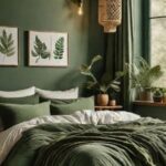
4. Add Olive Green for a Soft Moody Balance

Olive green brings a softer kind of drama. Designers often use it as wainscoting because it grounds the room without overpowering it. Pair it with metallic-finish upper walls, and the contrast feels intentional.
I love how olive green works with art. A large Japanese-style floral piece adds elegance and keeps the space from feeling too serious.
This combo feels curated, not trendy. It works especially well if you enjoy layering textures and finishes.
Why designers love olive green:
- It feels moody but approachable
- It pairs beautifully with metallics
- It works across styles, from modern to classic
Doesn’t it feel refreshing when a dark color still feels soft?
5. Use Matte Black for a Clean Modern Edge

Flat matte black walls look intimidating, but designers use them all the time. The secret lies in contrast. Light oak furniture and crisp white bedding stop the black from feeling overwhelming.
I once thought black walls felt risky. Then I saw how matte finishes absorb light instead of reflecting it. The result feels calm, not harsh.
This setup works best in rooms with clean lines and simple decor. Too much clutter ruins the effect.
Designer-approved tips:
- Always balance black with light wood
- Keep bedding simple and bright
- Let textures do the talking
And yes, black can feel cozy when done right
6. Try Dusty Navy for Warmth Without Heaviness

Dusty navy sits in a sweet spot. It feels dark but not dramatic. Designers use it when they want mood without intensity.
Cognac velvet pillows add warmth and richness. Mid-century wooden furniture brings structure and keeps the room grounded. I love how this combo feels timeless instead of trendy.
This color works especially well in bedrooms with good natural light. It absorbs brightness during the day and feels calm at night.
Why navy works:
- It feels cooler than black
- It pairs beautifully with warm accents
- It suits both modern and vintage styles
Ever noticed how navy feels easier to live with long-term?
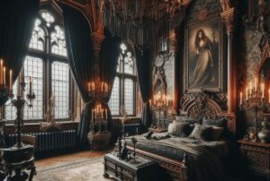
7. Full Black and Ornate Details

Some designers go all in. Black walls. Black ceiling. Ornate wall moldings. And honestly, when done right, it looks stunning.
This kind of bedroom feels theatrical. The crystal chandelier adds sparkle and stops the room from feeling flat. I’ve seen this in older homes, and it feels like stepping into a movie scene.
This look works best when you commit fully. Half measures ruin the effect.
Why designers love this approach:
- Black highlights architectural details
- A chandelier adds contrast and elegance
- The room feels bold and intentional
Would you dare to go this dramatic?
8. Use Charcoal for a Bold Industrial Mood

Charcoal walls instantly ground a bedroom. They feel strong without going full black, which makes them easier to live with. In industrial-style spaces, charcoal pairs beautifully with black wood paneling and concrete textures.
I love how charcoal hides imperfections and adds weight to the room. It also lets statement lighting shine. A sculptural sputnik chandelier pops harder against dark walls, don’t you think?
To make this work at home, focus on balance:
- Charcoal or concrete-textured paint for depth
- Black accents for structure
- One dramatic light fixture as a focal point
IMO, this setup works best if you like clean lines but still want drama.
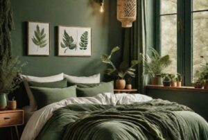
9. Go for Forest Green to Add Classic Warmth

Forest green feels timeless. It brings nature indoors without feeling trendy or loud. When designers use deep green wainscoting, the room instantly feels grounded and elegant.
I once stayed in a guest room painted this shade, and I slept like a baby. The color felt calm but rich, especially next to warm wood furniture. Classic artwork also feels more intentional against green walls.

Forest green works because it:
- Softens dark spaces
- Pairs well with warm woods
- Feels cozy without feeling heavy
Have you noticed how green never really goes out of style?
10. Create Drama with Textured Black Walls

Black walls scare people, but texture changes everything. In ultra-modern bedrooms, textured black paint adds depth and prevents the space from feeling flat. Designers often pair this look with greenery to keep it alive.
I love how plants pop against black. Even a small plant looks intentional and styled. Floor-to-ceiling windows also help by flooding the room with natural light.
To keep black walls livable:
- Use textured finishes
- Add real or integrated greenery
- Let natural light do its job
FYI, black works best when you lean into contrast instead of fighting it.
11. Add Emerald for a Dark Academia Feel

Emerald walls scream personality. They feel dramatic, moody, and intellectual all at once. Designers use this shade in dark academia bedrooms to create layers and visual richness.
I adore how emerald plays with vintage decor. Old portraits, crystals, and floral textiles feel intentional instead of cluttered. The color ties everything together.
This look thrives on layers:
- Emerald paint as the anchor
- Vintage artwork for character
- Mixed textures for warmth
If you love rooms that feel collected over time, this one hits hard.
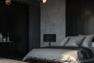
12. Use Matte Black for Minimalist Impact

Matte black feels calm, not loud. When designers paint both the walls and ceiling black, the room feels wrapped and restful. The trick lies in contrast.
Bright white bedding breaks up the darkness and keeps the space clean. Botanical line art adds softness without clutter. I’ve seen this setup work wonders in small bedrooms.
Key moves that make it work:
- Matte black walls and ceiling
- Crisp white bedding
- Simple line art for balance
Less really does more here, don’t you think?
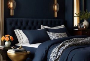
13. Choose Navy Blue for Understated Luxury

Navy blue feels rich but safe. It gives you depth without going too dark. Designers love navy because it pairs effortlessly with brass accents and warm seating.
I always notice how navy makes a room feel calmer at night. Add a textured headboard and ochre velvet seating, and the space feels layered but polished.
Why navy works so well:
- Feels timeless
- Works with warm metals
- Ages better than trendy shades
This color suits people who want moody without committing to black.
14. Use Dark Olive for a Cozy Modern Look

Dark olive brings warmth that black or charcoal can’t. Paneled walls in this shade feel grounded and inviting. Designers often pair olive with woven textures to soften the mood.
I love how olive looks next to rattan furniture. It feels earthy without going rustic. Soft pendant lighting finishes the look and keeps the room gentle.
To recreate this vibe:
- Dark olive paint for warmth
- Natural materials like rattan
- Soft lighting to avoid harsh shadows
This style feels perfect for winding down after long days.
15. Create Contrast with Black and White Luxury

High contrast always grabs attention. Black wallpaper behind a stark white bed creates instant drama. Designers use this combo to make bedrooms feel hotel-level luxurious.
What seals the deal is lighting. A glass starburst ceiling fixture adds sparkle and breaks the heaviness of black walls. I’ve seen this setup look stunning even in smaller rooms.
Make contrast work by:
- Keeping furniture clean and minimal
- Letting lighting steal the show
- Avoiding extra colors
This look feels bold but surprisingly clean.
16. Add Depth with Black Boiserie Walls

Black boiserie adds structure and elegance. It feels detailed without feeling busy. Designers pair this with softer elements like a tufted grey headboard to keep things balanced.
Rustic wood ceiling beams add warmth and stop the room from feeling too formal. I love how this mix feels both classic and relaxed.
To pull this off:
- Use paneling for texture
- Balance with soft fabrics
- Add natural wood for warmth
This style suits people who like classic design with a modern edge.
How to Choose the Right Dark Color for Your Bedroom
Picking dark paint feels risky, but a few checks help a lot. I always think about light first. Rooms with good natural light handle darker colors better.
Ask yourself:
- Does the room get daylight?
- Do I want cozy or dramatic?
- Can I balance with lighter furniture?
Answering these keeps regrets away.
Mistakes to Avoid with Dark Moody Bedroom Paint Colors
I’ve seen beautiful colors fail because of small mistakes. Avoid these, and you’re already ahead.
Common errors:
- Skipping layered lighting
- Ignoring texture
- Using dark paint with dark flooring only
- Overdecorating the space
Dark rooms need balance. Keep that in mind, and everything falls into place.
Final Thoughts on Dark Moody Bedroom Paint Colors
Dark moody bedroom paint colors aren’t just trendy. Designers love them because they create comfort, depth, and personality. Each shade tells a different story, from calm navy to dramatic black.
If you feel bored with light walls, try going darker. Start small if needed. Once you see how rich the space feels, you might never go back.
So tell me, which dark shade are you brave enough to try first?