You know that feeling when you walk into a bedroom and instantly feel calm, like the world just slows down a bit? That’s what the right moody bedroom paint color does. It wraps the room in a cozy, stylish vibe that feels both relaxing and a little dramatic.
I’ve played around with dark colors more than I’d like to admit, and honestly, they changed how my space feels at night. Lighter walls feel fresh, sure, but darker tones? They feel intentional. They feel like you actually designed your space, not just filled it.
19 Moody Bedroom Paint Colors
So if you’ve been thinking about going darker but feel a bit unsure, you’re not alone. Will it make your room too dark? Too heavy? Or will it turn your bedroom into your favorite place in the house? Let’s break it down.
1. Deep Navy Paint

If you want your bedroom to feel like a calm escape, deep navy blue does the job perfectly. Painting both the walls and ceiling in the same shade creates a seamless, cocoon-like space that feels intentional and cozy.
I love how this look balances dark and light. You get that bold navy, but you soften it with:
- Crisp white drapes to keep things fresh
- Black furniture for a clean, modern edge
- Warm gold lighting to add a soft glow
Ever notice how hotels use darker tones to make rooms feel more relaxing? This is exactly that vibe. IMO, this works best if you want something bold but still safe.
2. Charcoal Gray Paint

Charcoal gray can feel flat if you don’t add texture. That’s why vertical wood paneling changes everything here. It gives the wall depth and makes the color feel alive.
The matte finish absorbs light, which boosts that moody look without feeling dull. Pair it with:
- Leather accents for warmth
- Vintage rugs to break up the dark tones
- Black bed frames for a strong focal point
Want a room that feels modern but still cozy? This is it. The texture does most of the heavy lifting.
3. True Black Paint

Let’s be honest. Black walls sound scary, right? But when you do it right, they look insanely good.
A flat black finish creates a bold backdrop that makes everything else pop. Light pieces stand out more, especially:
- Cream or bouclé headboards
- Natural wood furniture
- Soft gray bedding
I tried a black wall once, and yeah, it felt intense at first. But after styling it? Total game changer. If you like contrast, this is your move.
4. Molding Anthracite Gray

If you want something moody but still elegant, go for anthracite gray with wall molding. The slight sheen highlights the details and makes the walls feel more expensive.
This look works because it mixes structure with softness:
- Light wood furniture warms things up
- Brass lighting adds a subtle glow
- Clean lines keep the room from feeling heavy
Ever wonder why some dark rooms feel classy instead of gloomy? It’s usually the details like this.
5. Warmth Chocolate Brown

Not all moody colors feel cool or dramatic. Chocolate brown brings warmth, and honestly, it feels super inviting.
This shade works best when you layer textures. Think:
- Velvet bedding in taupe and mocha tones
- Soft lighting from lamps or chandeliers
- Symmetrical layouts for a balanced look
FYI, this is one of the easiest dark colors to live with daily. It feels cozy, not overwhelming.
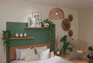
6. Organic Forest Green

If you like earthy vibes, deep forest green is a solid pick. In low light, it almost looks black, which adds depth without losing that natural feel.

Balance is key here. Pair it with:
- Light flooring to keep things open
- Off-white headboards for contrast
- Natural materials like jute or wood
This setup feels grounded and calm. Like bringing a bit of nature inside, but without going full jungle.
7. Midnight Indigo Paint

Midnight indigo sits right between blue and black, and it gives off a soft, velvety finish that feels rich without trying too hard.
What makes this one stand out?
- Monochrome navy bedding keeps it cohesive
- Green plants add life and contrast
- Woven lighting softens the overall look
Ever walk into a room and feel like it just “works”? That’s this color.
8. Warm Graphite Paint

Warm graphite feels like the grown-up version of gray. It’s dark, but it still reflects a bit of light, so it doesn’t feel flat.
Pair it with richer elements to elevate the space:
- Emerald velvet bedding for a luxe touch
- Dark wood furniture for depth
- Brass lamps for warmth
This style leans a bit more traditional, but it still feels fresh. Perfect if you like that slightly regal look.
9. Slate Blue-Gray Paint

Slate blue-gray gives you a softer take on moody colors. Add geometric wall molding, and suddenly the walls become a feature.
This combo works because it mixes cool tones with warmth:
- Copper accents add contrast
- Olive green textiles bring depth
- Black and brass elements sharpen the design
Want something stylish but not too bold? This hits the sweet spot.
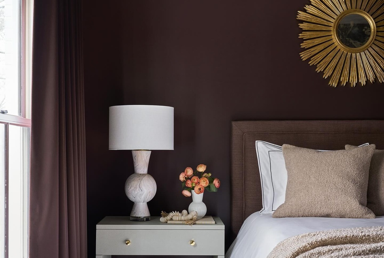
10. Deep Espresso-Aubergine

This color feels bold, but it works when you balance it right. The espresso-aubergine wall wraps the room in a cozy, almost cocoon-like vibe.
To keep it from feeling too heavy, you need contrast. Think:
- Light grey furniture
- White marble accents
- Gold decor pieces for a touch of shine
I love how a beige headboard and cream bedding soften everything. Without them, the room might feel too intense. Ever noticed how dark walls look better with lighter fabrics? That contrast does all the heavy lifting.
11. Forest Green Paint

If you want calm, this one hits the spot. Forest green walls instantly bring that grounded, outdoor vibe inside.
Keep things cohesive with a monochrome setup:
- Sage or green-toned bedding
- Wood elements for warmth
- Natural textures like jute rugs
And don’t skip plants. A tall indoor tree against deep green walls looks insane (in a good way). IMO, this is one of the easiest ways to make a moody bedroom feel alive instead of dark.
12. Deep Plum Paint

Want something rich but a little more elegant? Deep plum walls do the job.

Adding picture frame molding gives the room depth. It stops the color from looking flat and makes everything feel more styled.
Pair it with:
- Ivory or cream furniture
- Velvet textures
- Floral accents
This combo leans a bit classic, almost regal. Ever walked into a room that feels expensive without trying too hard? This is that vibe.
13. Chocolate Brown Paint

This one feels super underrated. Chocolate brown walls bring instant warmth and comfort.
Stick with a monochromatic palette to keep things simple:
- Matching wood tones
- Coffee-colored bedding
- Minimal decor
I like adding dried florals for a soft touch. They break up the heaviness without ruining the mood. And honestly, if you want a calm space with zero fuss, this works.
14. Hunter Green Color Drenching

Want drama? This is it. Hunter green on both walls and ceiling creates a full “wrapped” effect.
It sounds intense, but it works when you layer it right:
- Black furniture for depth
- Gold frames or accents for contrast
- Warm lighting to soften the darkness
Add a pop like an orange velvet pillow and suddenly the whole room glows. FYI, lighting matters a lot here. Without it, the space can feel too dark.
15. Dusty Antique Rose

Not all moody colors need to be dark. Dusty antique rose gives you that soft, romantic feel without losing depth.
This works best with vintage-inspired details:
- Fluted headboards
- Crystal lighting
- Botanical or floral decor
It feels cozy but still light enough to keep the room open. Ever wanted a moody space that doesn’t feel heavy? This is your answer.
16. Matte Charcoal Black

If you love bold spaces, go with matte charcoal black walls. They create a strong base that makes everything else pop.
Balance it with natural elements:
- Raw wood furniture
- Woven lighting
- Neutral bedding like sand or linen tones
I’ve tried this look, and the trick is texture. Without it, black walls can feel flat. With it, the room feels modern and grounded.
17. Burnt Terracotta Paint

This color feels warm and bold at the same time. Burnt terracotta walls bring that desert-inspired vibe into your space.
To keep it balanced:
- Pair with black furniture
- Add patterned ceilings or accents
- Keep decor simple
That mix of warm walls and dark furniture creates a strong contrast. And honestly, it makes the room feel unique without trying too hard.
18. Muted Clay Red

If bright red feels too much, go softer. Muted clay-red walls still bring warmth but feel more relaxed.
Extend the color onto doors or trims for a clean look. Then add:
- Dark wood furniture
- Small pops of color like yellow florals
That little contrast keeps the room from feeling flat. Ever noticed how one bright detail can wake up a whole space? That’s what’s happening here.
19. Oxblood Red Paint

This one is bold. Oxblood red walls create a dramatic, high-end feel right away.
To balance it out:
- Use light or neutral furniture
- Add simple art pieces
- Mix in wood or metal accents
I like how grey upholstery tones things down without killing the vibe. It’s strong, but still stylish. Not for everyone, but if you love drama, this hits.
How to Balance Moody Bedroom Paint Colors
Dark colors look great, but balance matters. Skip this, and your room might feel heavy.
Here’s what actually works:
- Mix light and dark elements to create contrast
- Use warm lighting to soften deep tones
- Add texture like wood, fabric, or woven pieces
- Keep clutter low so the color stands out
Think of it like this. The paint sets the mood, but everything else supports it.
How to Choose the Right Moody Bedroom Paint Color
Picking the right shade can feel tricky, but it gets easier when you focus on a few things:
- Room size: Dark colors can work in small rooms if you balance them well
- Lighting: Natural and artificial light change how the color looks
- Furniture tone: Mix light and dark pieces for contrast
Ask yourself this. Do you want cozy, dramatic, or balanced? Your answer will point you to the right color.
Tips to Keep a Moody Bedroom from Feeling Too Dark
Dark walls don’t mean a dark room. You just need the right balance.
- Use layered lighting like lamps and pendants
- Add lighter textiles to break up the darkness
- Mix textures so the space feels rich, not flat
- Include metallic accents for a bit of glow
Small tweaks make a big difference. You don’t need to overthink it.
Final Thoughts
Moody bedroom paint colors aren’t just about going dark. They’re about creating a space that feels calm, stylish, and a little personal.
From deep navy and charcoal gray to black, brown, and forest green, each option brings a different vibe. Some feel bold, others feel warm, but all of them can turn your bedroom into a space you actually want to relax in.
So what’s stopping you? Try one wall first if you feel unsure. Or go all in and see how it transforms your space. You might end up loving it more than you expected