Red shower curtains don’t whisper. They announce themselves, and honestly, that’s exactly why I love them. If your bathroom feels a little too safe or forgettable, red fixes that fast. I’ve experimented with red accents more times than I can count, and every single time, the space instantly felt more confident.
Maybe you’ve stared at your bathroom lately and thought, Why does this room feel so flat? I’ve been there. Paint feels permanent, tiles feel expensive, but a shower curtain? That’s the sweet spot where bold meets low commitment.
14 Chic Red Shower Curtain Picks for a Stylish Bathroom Refresh
Let’s talk about red shower curtain ideas that actually work, not just ones that look good in photos. I’ll walk you through each style like we’re chatting decor over coffee—and yes, I’ll tell you when something works and why it works.
1. Use Bold Red and White Stripes for Instant Drama

If you want your bathroom to feel unforgettable, bold red and white stripes do the job immediately. I’ve used stripes before, and they bring energy without feeling chaotic when you balance them right. Pairing them with checkerboard red tile pushes the drama even further—in a good way.
This look works because stripes create movement. Your eyes travel upward, which makes the bathroom feel taller and more intentional. Ever noticed how boring bathrooms usually feel boxed in?
Why this idea works so well:
- High contrast grabs attention instantly
- Vertical stripes add visual height
- Red and white keep the look clean, not heavy
IMO, this style fits anyone who loves bold design and isn’t afraid to commit.
2. Go for Soft Pink and Red Stripes in Antique Spaces

Red doesn’t always need to shout. In an antique-style bathroom, pink and red stripes soften the impact while still making a statement. I love how this combo feels romantic without turning sugary.
The trick here lies in the lightness. Soft stripes pair beautifully with double sinks, vintage mirrors, and warm finishes. Have you ever noticed how antique bathrooms shine when colors feel layered instead of loud?
Helpful tips for this look:
- Choose muted reds instead of fire-engine tones
- Let natural light highlight the stripes
- Keep accessories neutral so the curtain shines
This option works perfectly if you want personality without overpowering the room.
3. Create a Modern Edge with Red Polka Dots

Large red polka dots instantly shift the vibe into modern territory. I tried a polka-dot curtain once, and it made my bathroom feel playful without feeling childish. Against mint green tiles, the contrast feels fresh and unexpected.
Polka dots break up flat spaces beautifully. They add rhythm, which keeps the room from feeling static. Have you ever walked into a bathroom that felt fun and stylish?
Why this idea feels so fresh:
- Graphic patterns create movement
- Red pops against cool-toned walls
- Large dots feel intentional, not busy
FYI, this look works best when everything else stays simple.
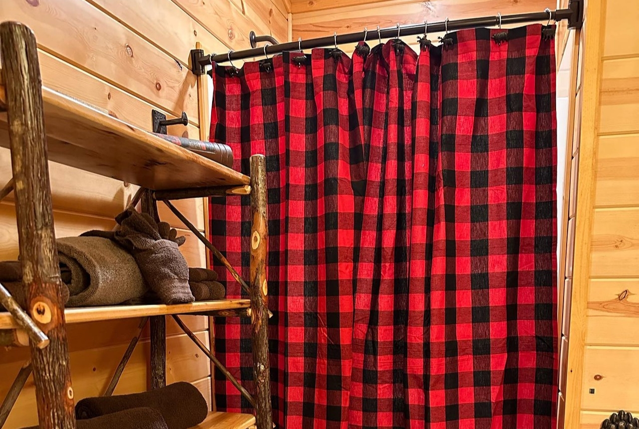
4. Add Cozy Contrast with Buffalo Check Patterns

Nothing says cozy like black and red buffalo check, especially in a rustic log cabin bathroom. I love how this pattern instantly grounds the space and makes it feel warm and lived-in. Add bear silhouettes, and suddenly the bathroom tells a story.
This design thrives on contrast. Red adds warmth, black adds structure, and wood tones tie everything together. Don’t you love when a bathroom feels like an extension of the home instead of an afterthought?
Make this style work by:
- Pairing it with natural wood textures
- Keeping lighting warm and soft
- Avoiding shiny finishes that break the rustic vibe
This curtain turns a simple bathroom into a cozy retreat.
5. Use Gingham Ruffles for Farmhouse Charm

A red and white gingham shower curtain with ruffles screams farmhouse comfort, and I mean that in the best way. I’ve always loved how gingham feels welcoming without trying too hard. The ruffles add texture, which keeps the look from feeling flat.
This style shines in cozy bathrooms with vintage fixtures and neutral walls. Ever notice how farmhouse spaces feel calm even when patterns show up?
Why gingham works so well:
- Classic pattern never feels trendy
- Ruffles add softness and movement
- Red brings warmth to neutral spaces
This idea feels perfect if your goal involves comfort over perfection.
6. Choose Wide Stripes for a Relaxed Rustic Look

Wide red and off-white stripes feel calmer than narrow ones, which makes them perfect for rustic bathrooms filled with light. I’ve used wide stripes before, and they always make the space feel relaxed instead of busy.
This look pairs beautifully with wood accents and natural textures. The wider spacing lets the red breathe, so it doesn’t overwhelm the room. Have you noticed how some bold designs still feel peaceful?
Best ways to style this idea:
- Match with wood shelves or beams
- Keep metals warm, not chrome
- Let sunlight do the heavy lifting
This curtain works when you want bold color without visual noise.
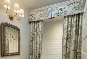
7. Add Elegance with Red Damask Patterns

If you want drama with refinement, red damask delivers every time. I love how damask patterns feel timeless without feeling old. Pairing them with stripes adds depth without cluttering the space.
This style works especially well in vintage bathrooms with bright light and decorative rugs. Doesn’t it feel amazing when a bathroom feels dressed instead of decorated?
Why damask feels elevated:
- Ornate patterns add luxury
- Red feels rich instead of loud
- Stripes balance the detailed design
This idea suits anyone who wants boldness with polish.
8. Use Wide Red and White Stripes for a Nautical Look

Wide red and white stripes instantly give off a coastal, nautical vibe, especially when beadboard paneling enters the picture. I love how this style feels fresh and playful without trying too hard. It reminds me of beach houses where everything feels relaxed but thoughtfully put together.

This look works best when you keep the rest of the bathroom calm and light. Think white walls, simple fixtures, and maybe a rope or wood accent. Why fight the stripes when you can let them be the star?
Why this works so well:
- Wide stripes feel bold but balanced
- Red adds energy while white keeps things crisp
- Perfect for coastal, cottage, or seaside themes
9. Go for a Deep Red Jacquard Behind a Freestanding Tub

If you want your bathroom to feel elegant and almost hotel-like, this one hits hard—in a good way. A deep red jacquard or brocade curtain behind a white freestanding tub creates instant contrast. I’ve seen this setup in person, and it honestly feels luxurious without being flashy.
The texture does most of the work here. Instead of loud patterns, you get subtle depth that feels grown-up and intentional. Have you noticed how textured fabrics always read as more expensive?
Best styling tips:
- Pair with simple white tubs and walls
- Let the curtain be the only bold pattern
- Add warm lighting to enhance the richness
10. Add a Solid Ruby Red Curtain for Clean Drama

Sometimes simple wins. A solid ruby red velvet-look shower curtain brings drama without visual clutter. I like this option when the bathroom already has neutral tiles and clean lines.
Matching the bath mat pulls everything together and makes the space feel cohesive instead of random. This setup works especially well if you love bold color but hate busy patterns. Do you prefer calm spaces with one strong focal point?
Why this idea feels effortless:
- Solid colors feel timeless
- Velvet-look fabric adds softness
- Easy to style with neutral tiles
11. Create Luxury with a Ruffled Tie-Back Curtain

This is for anyone who loves a little drama. A ruffled, tie-back ruby red shower curtain feels straight out of a boutique hotel or classic movie set. I’ve always loved how tie-backs make a shower curtain feel more like a design feature than a necessity.
Keeping the curtain draped open also prevents the space from feeling closed in. You still get the bold red, but in a controlled, elegant way. Doesn’t that balance feel just right?
Why it stands out:
- Ruffles add softness and movement
- Tie-backs make the tub feel showcased
- Great for romantic or vintage-inspired bathrooms
12. Choose Narrow Red Stripes for Vintage Charm

Narrow red and white stripes tell a different story than wide ones. They feel more vintage and delicate, especially around a claw-foot tub with brass fittings. I love how this style feels airy instead of heavy.
This setup works beautifully in rustic or farmhouse bathrooms where natural light plays a big role. Have you noticed how thinner stripes always feel a little more refined?
Key benefits of this look:
- Narrow stripes feel lighter visually
- Red adds warmth without overpowering
- Perfect for vintage and rustic spaces
13. Embrace Full Drama with a Dark Red Curtain

This one isn’t for the faint of heart—and that’s why I love it. A dark red shower curtain in a bathroom with red walls and cabinets creates a bold, immersive experience. The white subway tile saves the space from feeling too heavy.
I’ve seen rooms like this feel surprisingly cozy instead of overwhelming. The trick lies in repeating the color intentionally. Would you dare to go all-in like this?
How to make it work:
- Break up red with white tile
- Keep lines clean and structured
- Use consistent shades of red
14. Mix Red with Mint for a Modern Pop

Red and mint might sound risky, but trust me—it works. A solid red curtain with brown trim against mint green tiles feels modern, playful, and unexpected. I love color combos that make people stop and look twice.
The brown trim acts as a bridge between bold and calm. It grounds the design and keeps everything from feeling chaotic. Isn’t it fun when a bathroom surprises you?
Why this combo feels fresh:
- Mint cools down the red
- Brown trim adds structure
- Perfect for modern or retro-inspired spaces
How to Choose the Right Red for Your Bathroom
Not all reds feel the same, and choosing the wrong shade can throw off the whole vibe. I always recommend thinking about lighting first. Natural light makes bright reds pop, while darker bathrooms benefit from deeper tones.
Also consider how bold you want to go. Do you want drama or balance? Your answer should guide your choice.
Quick tips:
- Bright red = energetic and playful
- Deep red = cozy and luxurious
- Textured fabric = more depth and elegance
Styling Mistakes to Avoid with Red Shower Curtains
Red demands respect, and I’ve learned that the hard way. Too many patterns or competing colors can make the space feel chaotic fast. Keep supporting elements simple and intentional.
Also, don’t ignore hardware and accessories. They matter more than people think.
Avoid these common mistakes:
- Mixing too many bold colors
- Ignoring lighting conditions
- Using cheap-looking fabrics
Final Thoughts
Red shower curtains bring personality faster than almost any other bathroom update. Whether you love stripes, checks, or damask, there’s a red style that fits your space and your confidence level. I’ve learned that bathrooms don’t need to play it safe to feel inviting.
So ask yourself—do you want a bathroom people forget, or one they remember? Sometimes, all it takes is a bold curtain and a little courage to find out.